library(tidyverse)
library(readxl)
library(FactoMineR)
library(factoextra)Exercise 3: Exploratory Data Analysis - Solution
Getting started
- Load in the packages the you think you need for this exercise. You will be doing PCA, so have a look at which packages we used in Presentation 3. No worries if you forget any, you always load then later on.
Read in the joined diabetes data set you created in Exercise 2. If you did not make it all the way through Exercise 2 you can find the dataset you need in
../data/exercise2_diabetes_glucose.xlsx.Have a look at the data type (
numeric,categorical,factor) of each column to ensure these make sense. If need, convert variables to the correct (most logical) type.
diabetes_glucose <- read_xlsx('../data/exercise2_diabetes_glucose.xlsx')

diabetes_glucose
# A tibble: 1,422 × 13
ID Sex Age BloodPressure BMI PhysicalActivity Smoker Diabetes
<chr> <chr> <dbl> <dbl> <dbl> <dbl> <chr> <dbl>
1 34120 Female 28 75 25.4 92 Never 0
2 34120 Female 28 75 25.4 92 Never 0
3 34120 Female 28 75 25.4 92 Never 0
4 27458 Female 55 72 24.6 86 Never 0
5 27458 Female 55 72 24.6 86 Never 0
6 27458 Female 55 72 24.6 86 Never 0
7 70630 Male 22 80 24.9 139 Unknown 0
8 70630 Male 22 80 24.9 139 Unknown 0
9 70630 Male 22 80 24.9 139 Unknown 0
10 13861 Female 56 72 37.1 64 Unknown 1
# ℹ 1,412 more rows
# ℹ 5 more variables: Serum_ca2 <dbl>, Married <chr>, Work <chr>,
# Measurement <chr>, `Glucose (mmol/L)` <dbl>Check Data Distributions
Let’s have a look at the distributions of the numerical variables.
- Make histograms of the three
Glucose (mmol/L)measurements in your dataset. What do you observe? Are the three groups of values normally distributed?
ggplot(diabetes_glucose, aes(x = `Glucose (mmol/L)`)) +
  geom_histogram(bins = 30, fill = "#482878FF", color = "white") +
  theme_minimal() +
  facet_wrap(vars(Measurement), nrow = 2, scales = "free")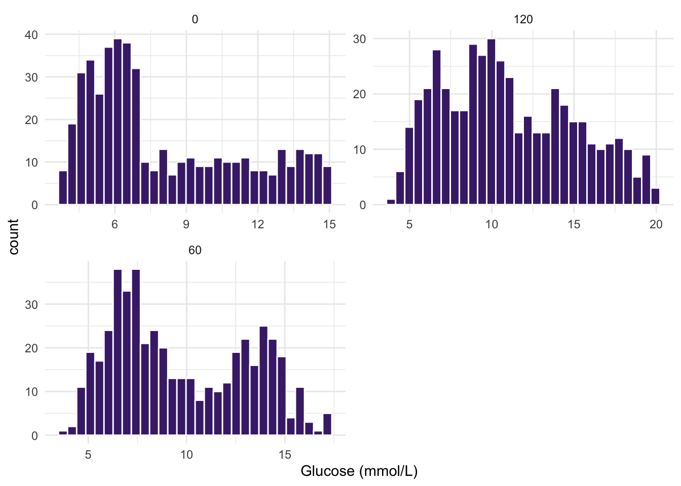
- Just as in question 3 above, make histograms of the three
Glucose (mmol/L)measurement variables, BUT this time stratify your dataset by the variableDiabetes. How do your distributions look now?
TipHint
Try: facet_wrap(Var1 ~ Var2, scales = "free").
ggplot(diabetes_glucose, aes(x = `Glucose (mmol/L)`)) +
  geom_histogram(bins = 30, fill = "#482878FF", color = "white") +
  theme_minimal() +
  facet_wrap(Diabetes ~ Measurement, nrow = 2, scales = "free")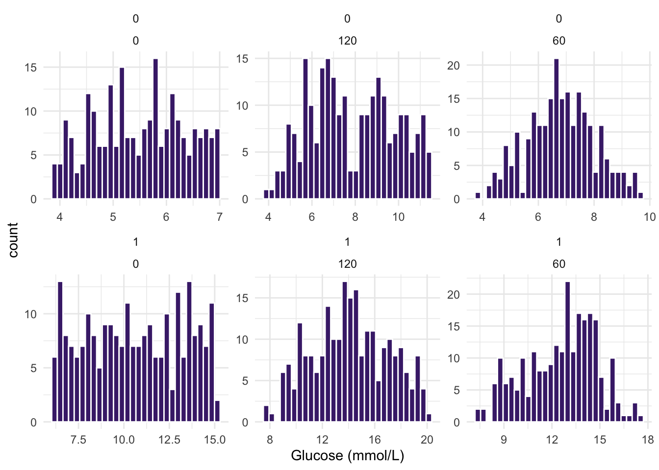
- Make a qqnorm plot for the other numeric variables;
Age,Bloodpressure,BMI,PhysicalActivityandSerum_ca2. What do the plots tell you?
df_long <- diabetes_glucose %>%
  dplyr::select(Age, BloodPressure, BMI, PhysicalActivity, Serum_ca2)  %>%
  pivot_longer(cols = everything(),
               names_to = "variable",
               values_to = "value")

# QQ plot
ggplot(df_long, aes(sample = value)) +
  geom_qq_line(color = "magenta4") +
  geom_qq(alpha = 0.7, size = 0.5) +
  labs(title = "QQ Plot for Gene Expression",
       x = "Theoretical Quantiles", y = "Sample Quantiles") +
  theme_minimal() +
  facet_wrap(vars(variable), nrow = 2, scales = "free")
Warning: Removed 6 rows containing non-finite outside the scale range
(`stat_qq_line()`).Warning: Removed 6 rows containing non-finite outside the scale range
(`stat_qq()`).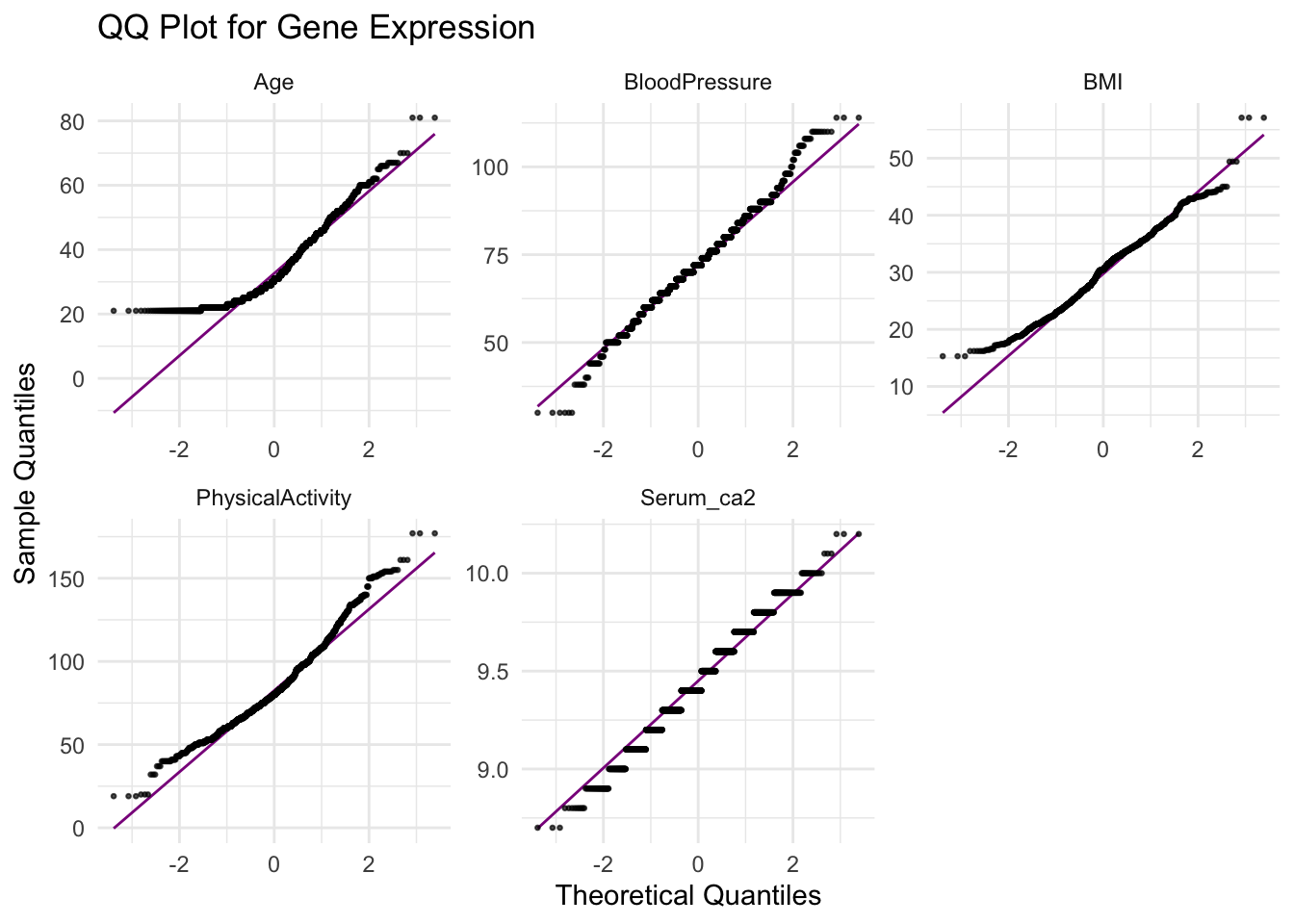
- From the qq-norm plot above you will see that especially one of the variables seems to be far from normally distributed. What type of transformation could you potentially apply to this variable to make it normal? Transform and make a histogram or qqnorm plot. Did the transformation help?
ggplot(diabetes_glucose, aes(x = Age)) +
  geom_histogram(bins = 30, fill = "#A8D898", color = "white") +
  theme_minimal()
Warning: Removed 6 rows containing non-finite outside the scale range
(`stat_bin()`).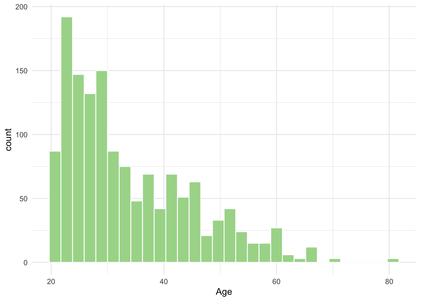
ggplot(diabetes_glucose, aes(x = log2(Age))) +
  geom_histogram(bins = 30, fill = "#A8D898", color = "white") +
  theme_minimal()
Warning: Removed 6 rows containing non-finite outside the scale range
(`stat_bin()`).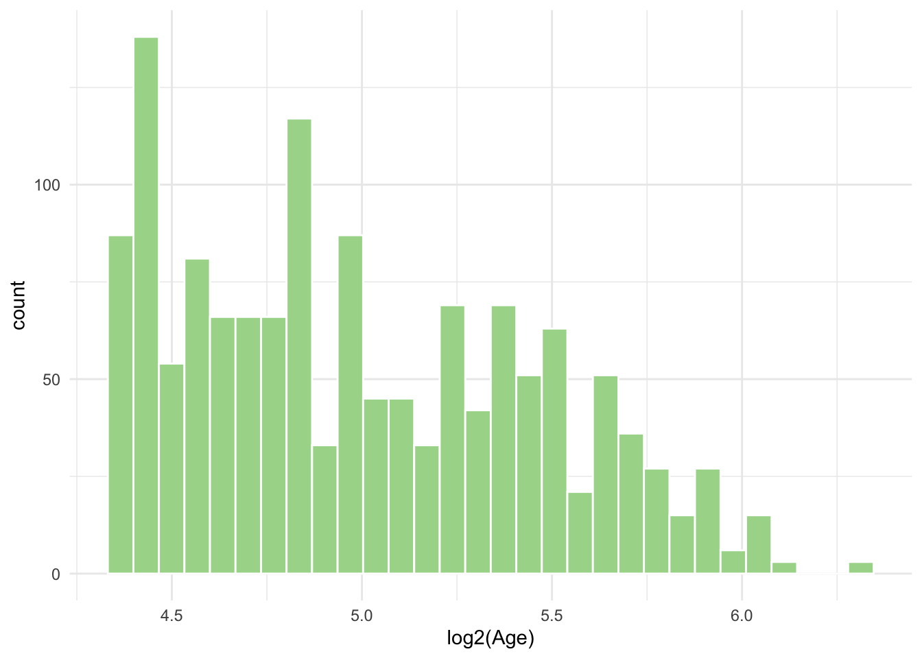
Luckily for us it is not a requirement for dimensionality reduction methods like PCA that neither variables nor their residuals were normally distributed. Requirements for normality becomes important when performing statistical tests and modelling, including t-tests, ANOVA and regression models (more on this in part 5).
Data Cleaning
While PCA is very forgiving in terms of variable distributions, there are some things it does not handle well, including missing values and varying ranges of numeric variables. So, before you go on you need to do a little data management.
- The
Glucose (mmol/L)variable in the dataset which denotes the result of theOral Glucose Tolerance Testwith measurements at times the0,60,120min should be separated out into three columns, one for each time point.
diabetes_glucose <- diabetes_glucose %>%
  pivot_wider(names_from = Measurement,
              values_from = `Glucose (mmol/L)`,
              names_prefix = 'Measurement_')

diabetes_glucose- Remove any missing values from your dataset.
diabetes_glucose <- diabetes_glucose %>%
drop_na()- Extract all numeric variables AND scale these so they have comparable ranges. This numeric dataset you will use for PCA.
diab_glu_num <- diabetes_glucose %>%
  dplyr::select(where(is.numeric)) %>%
  scale()

head(diab_glu_num)
Age BloodPressure BMI PhysicalActivity Diabetes Serum_ca2
[1,] -0.5095355 0.18808364 -0.7123872 0.31233047 -1.003892 0.6085078
[2,] -0.5095355 0.18808364 -0.7123872 0.31233047 -1.003892 0.6085078
[3,] -0.5095355 0.18808364 -0.7123872 0.31233047 -1.003892 0.6085078
[4,] 1.8586337 -0.04390803 -0.8322613 0.07595423 -1.003892 -0.9482168
[5,] 1.8586337 -0.04390803 -0.8322613 0.07595423 -1.003892 -0.9482168
[6,] 1.8586337 -0.04390803 -0.8322613 0.07595423 -1.003892 -0.9482168
Glucose (mmol/L)
[1,] -1.0027491
[2,] -1.0027491
[3,] -1.0027491
[4,] -1.1514897
[5,] -0.7756125
[6,] -0.2183909- Extract all categorical variables from your dataset and save them to a new object. You will use these as labels for the PCA.
diab_glu_cat <- diabetes_glucose %>%
  dplyr::select(where(is.character), Diabetes) %>%
  mutate(Diabetes = as.factor(Diabetes))

head(diab_glu_cat)
# A tibble: 6 × 7
ID Sex Smoker Married Work Measurement Diabetes
<chr> <chr> <chr> <chr> <chr> <chr> <fct>
1 34120 Female Never No Public 0 0
2 34120 Female Never No Public 60 0
3 34120 Female Never No Public 120 0
4 27458 Female Never No SelfEmployed 0 0
5 27458 Female Never No SelfEmployed 60 0
6 27458 Female Never No SelfEmployed 120 0 Principal Component Analysis
- Calculate the PCs on your numeric dataset using the function
PCA()from theFactoMineRpackage. Note that you should setscale.unit = FALSEas you have already scaled your dataset.
res.pca <- PCA(diab_glu_num, graph = FALSE)

res.pca
**Results for the Principal Component Analysis (PCA)**
The analysis was performed on 1416 individuals, described by 7 variables
*The results are available in the following objects:
name description
1 "$eig" "eigenvalues"
2 "$var" "results for the variables"
3 "$var$coord" "coord. for the variables"
4 "$var$cor" "correlations variables - dimensions"
5 "$var$cos2" "cos2 for the variables"
6 "$var$contrib" "contributions of the variables"
7 "$ind" "results for the individuals"
8 "$ind$coord" "coord. for the individuals"
9 "$ind$cos2" "cos2 for the individuals"
10 "$ind$contrib" "contributions of the individuals"
11 "$call" "summary statistics"
12 "$call$centre" "mean of the variables"
13 "$call$ecart.type" "standard error of the variables"
14 "$call$row.w" "weights for the individuals"
15 "$call$col.w" "weights for the variables" - Make a plot that shows how much variance is captured by each component (in each dimension). There are two ways of making this plot: either you can use the function
fviz_screeplot()from thefactoextrapackage as we did in the exercise OR, you can use ggplot2, by extracting theres.pca$eigand plotting thepercentage of variancecolumn.
PC_df <- as.data.frame(res.pca$eig) %>%
  rownames_to_column(var = 'components')

labs <- round(PC_df$`percentage of variance`, digits = 2) %>%
  as.character()

ggplot(PC_df, aes(x=components, y=`percentage of variance`, fill = eigenvalue)) +
  geom_col() +
  theme_minimal() +
  geom_text(aes(label = labs), vjust = -0.5)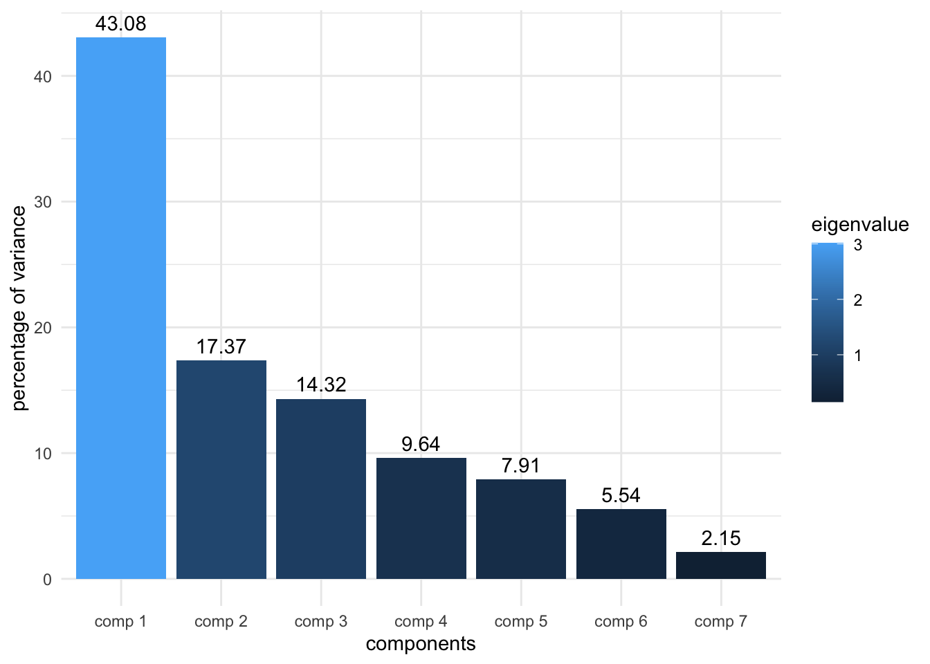
- Now, make a biplot (the round one with the arrows we showed in the presentation). This type of plot is a little complicated with ggplot alone, so either use the
fviz_pca_var()function from thefactoextrapackage we showed in the presentation, or - if you want to challenge yourself - tryautoplot()from theggfortifypackage.
fviz_pca_var(res.pca, col.var = "cos2",
             gradient.cols = c("#00AFBB", "#E7B800", "#FC4E07"),
             repel = TRUE) # Avoid text overlapping)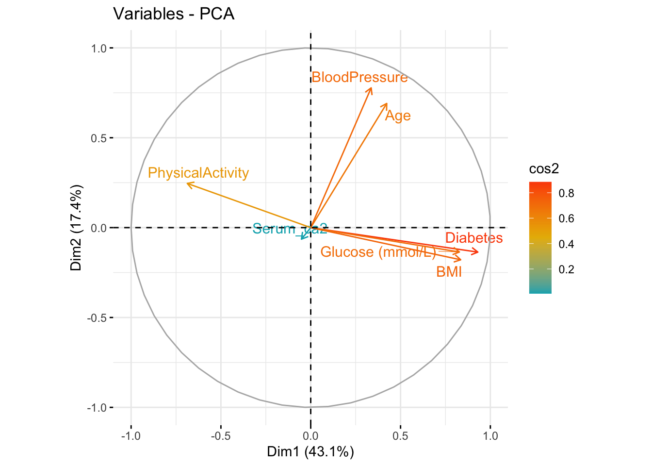
Have a look at the
$var$contribfrom your PCA object and compare it to the biplot, what do they tell you, i.e. which variables contribute the most to PC1 (dim1) and PC2 (dim2)? Also, look at the correlation matrix between variables in each component ($var$cor), what can you conclude from this?Plot your samples in the new dimensions, i.e. PC1 (dim1) vs PC2 (dim2), with the function
fviz_pca_ind(). Add color and/or labels to the points using categorical variables you extracted above. What pattern of clustering (in any) do you observe?
p1 <- fviz_pca_ind(res.pca,
                   axes = c(1, 2),
                   col.ind = diab_glu_cat$Diabetes,
                   geom = "point",
                   legend.title = "Diabetes") +
  scale_color_viridis_d() +
  theme(legend.position = "bottom")

p1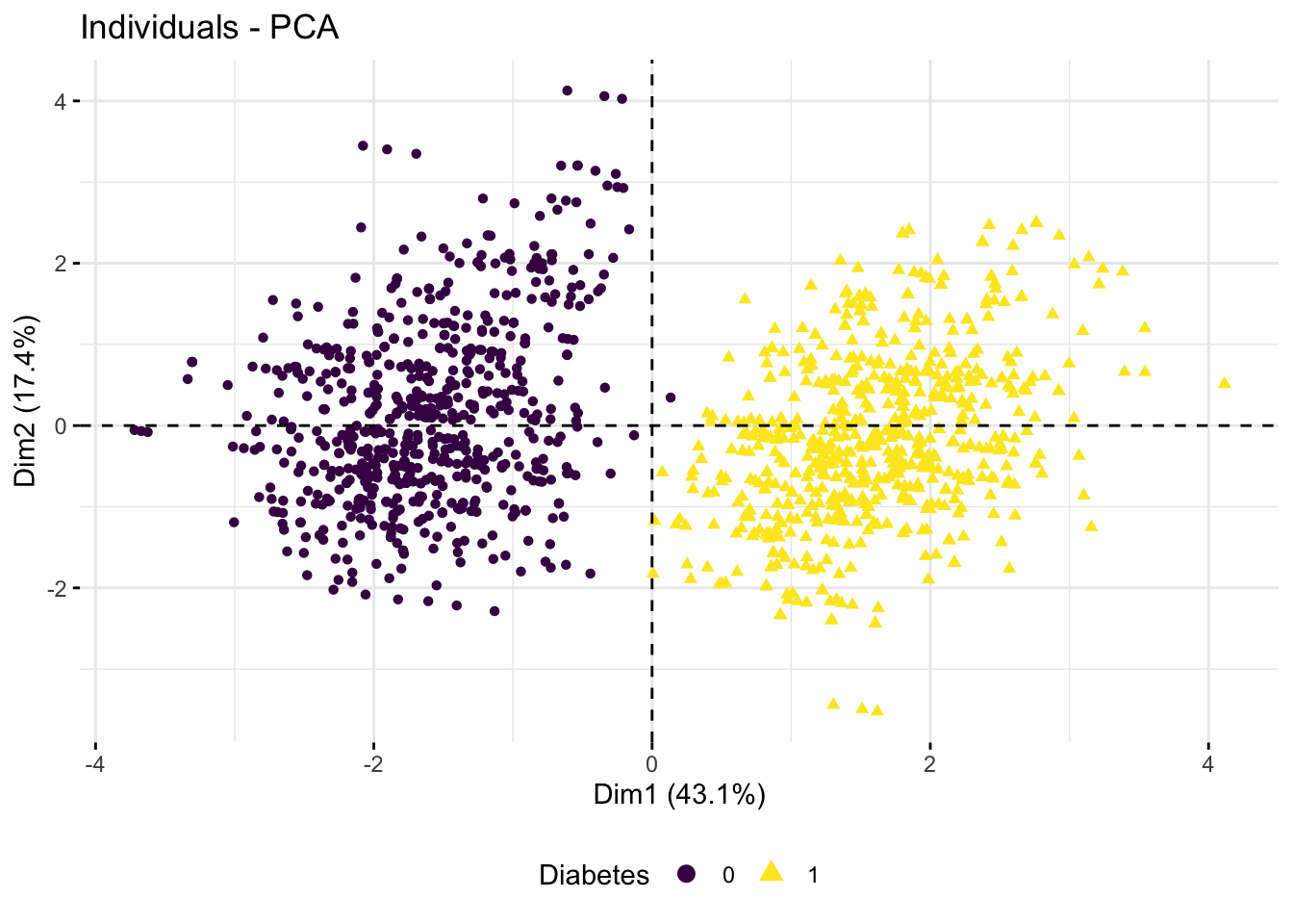
- Try to call
$var$cos2from your PCA object. What does it tell you about the first 5 components? Are there any of these, in addition to Dim 1 and Dim 2, which seem to capture some variance? If so, try to plot these components and overlay the plot with the categorical variables from above to figure out which it might be capturing.
p1 <- fviz_pca_ind(res.pca,
                   axes = c(1, 4),
                   col.ind = diab_glu_cat$Smoker,
                   geom = "point",
                   legend.title = "Smoker") +
  scale_color_viridis_d() +
  theme(legend.position = "bottom")

p1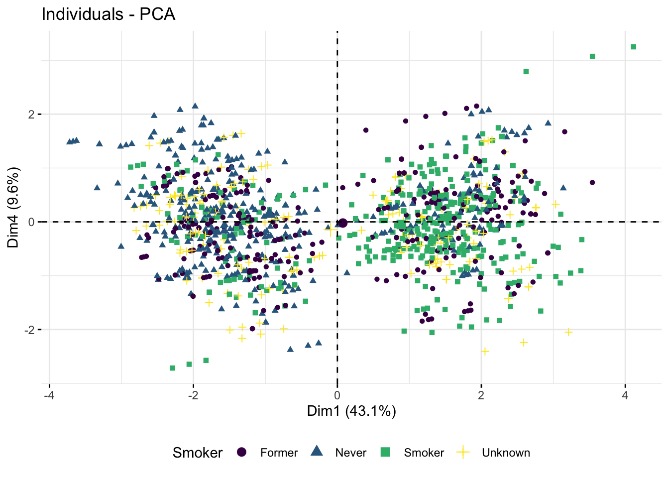
The Oral Glucose Tolerance Test is the one used to produce the OGTT measurements (0, 60, 120). As these measurement are directly used to diagnose diabetes we are not surprised that they separate the dataset well - we are being completely bias.
- Omit the Glucose measurement columns, calculate a PCA and create the plot above. Do the remaining variables still capture the
Diabetespattern?
diab_glu_num <- diabetes_glucose %>%
  dplyr::select(Age,BloodPressure, BMI, PhysicalActivity, Serum_ca2) %>%
  scale()

head(diab_glu_num)
res.pca <- PCA(diab_glu_num, graph = FALSE)
res.pca$var$cos2 Dim.1 Dim.2 Dim.3 Dim.4 Dim.5
Age 0.179044228 0.47738224 1.179010e-02 0.237077768 0.0822648503
BloodPressure 0.113238994 0.60479871 2.125569e-06 0.156507251 0.1174344511
BMI 0.697020728 0.03199509 6.799622e-04 0.066308130 0.0018402460
PhysicalActivity 0.472545917 0.06049427 5.974280e-03 0.186643304 0.2670768712
Diabetes 0.865617192 0.01854276 1.265714e-05 0.004176319 0.0085933098
Serum_ca2 0.002695452 0.00411849 9.832735e-01 0.009567730 0.0002967391
Glucose (mmol/L) 0.685119304 0.01840264 7.080813e-04 0.014552326 0.0759039042fviz_pca_var(res.pca, col.var = "cos2",
gradient.cols = c("#00AFBB", "#E7B800", "#FC4E07"),
repel = TRUE) 
fviz_pca_ind(res.pca,
             axes = c(1, 2),
             col.ind = diab_glu_cat$Diabetes,
             geom = "point",
             legend.title = "Diabetes") +
  scale_color_viridis_d() +
  theme(legend.position = "bottom")
- From the exploratory analysis you have performed, which variables (numeric and/or categorical) would you as a minimum include in a model for prediction of
Diabetes? N.B again you should not include the actual glucose measurement variables as they where used to the define the outcome you are looking at.
diab_model <- lm(Diabetes ~ PhysicalActivity + BMI + BloodPressure + Smoker, data = diabetes_glucose)

summary(diab_model)
Call:
lm(formula = Diabetes ~ PhysicalActivity + BMI + BloodPressure +
    Smoker, data = diabetes_glucose)

Residuals:
     Min       1Q   Median       3Q      Max
-0.98302 -0.17105  0.00882  0.21386  0.60857

Coefficients:
                   Estimate Std. Error t value Pr(>|t|)
(Intercept)      -0.6850976  0.0653602 -10.482  < 2e-16 ***
PhysicalActivity -0.0047429  0.0003280 -14.459  < 2e-16 ***
BMI               0.0456946  0.0012681  36.035  < 2e-16 ***
BloodPressure     0.0026039  0.0005694   4.573 5.23e-06 ***
SmokerNever      -0.0829057  0.0202943  -4.085 4.65e-05 ***
SmokerSmoker      0.1329873  0.0198258   6.708 2.85e-11 ***
SmokerUnknown     0.0147172  0.0238776   0.616    0.538
---
Signif. codes:  0 '***' 0.001 '**' 0.01 '*' 0.05 '.' 0.1 ' ' 1

Residual standard error: 0.2712 on 1409 degrees of freedom
Multiple R-squared:  0.7073,    Adjusted R-squared:  0.7061
F-statistic: 567.6 on 6 and 1409 DF,  p-value: < 2.2e-16