#if (!require("BiocManager", quietly = TRUE))
#    install.packages("BiocManager")
# BiocManager::install("DESeq2")

library(tidyverse)
library(FactoMineR) # FactoMineR for PCA computation and factoextra for pretty plots
library(factoextra)
library(ggpubr)
library(DESeq2)

load("../data/GDC_Ovarian_explored.RData")Presentation 3 - EDA - Multivariate Analysis
In this section, we move beyond basic summary statistics and simple two-variable plots to explore more complex structure in the data.
We will use Principal Component Analysis (PCA), a widely used dimensionality-reduction method, to summarize major patterns of variation across samples and genes.
Our main goal is to investigate whether the collagen (COL) gene family is associated with ovarian cancer biology, and whether tumor characteristics such as stemness score and cell type proportions influence collagen gene expression.
We also want to examine whether patient characteristics, such as tumor stage, align with major expression patterns.
Load packages and the data
Let’s get started by loading the necessary libraries and the cleaned dataset we explored in previous sections:
Normality and Data Transformation
Before applying PCA or other multivariate methods, it is useful to inspect the distribution of our continuous sample-level variables, such as age or estimated cell-type proportions. Highly skewed variables can dominate variance-based methods, so checking their distributions helps us decide whether transformation is needed.
Checking for Normality: QQ Plot
A simple way to assess how close a variable is to a normal distribution is to use a QQ plot. A QQ plot compares the observed quantiles of the data to the quantiles expected under a normal distribution.
If the points follow the diagonal line closely, the distribution is approximately normal.
If the points curve upward, the variable is typically right-skewed.
If the points curve downward, the variable is typically left-skewed.
To do this for all continuous variables at once, we first reshape the data to long format:
# Pivot columns to long format for easy faceting
df_long <- df_comb %>%
  select(where(is.double)) %>%
  pivot_longer(everything(),
               names_to = "variable",
               values_to = "value")

# QQ plots faceted by variable
ggplot(df_long, aes(sample = value)) +
  geom_qq_line(color = "red") +
  geom_qq(color = "#482878FF", alpha = 0.7) +
  labs(title = "QQ Plot for Clinical Variables",
       x = "Theoretical Quantiles",
       y = "Sample Quantiles") +
  theme_minimal() +
  facet_wrap(vars(variable), nrow = 2, scales = "free")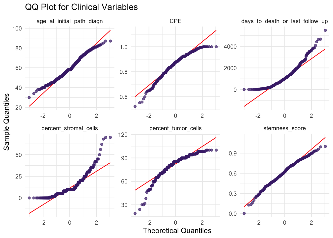
Here, age appears reasonably close to normal, while variables such as cell-type proportions are more skewed. This is common in biomedical data, where many measurements are naturally asymmetric.
Transformations to Reduce Skewness
Depending on the variable, transformations can make distributions easier to compare and better suited for downstream analysis.
Common transformations include:
log transformation for strongly right-skewed variables
square-root transformation for moderately skewed variables
power transformations for variables compressed near one end of the scale
The goal is not perfect normality, but rather to reduce extreme skewness so that no single variable dominates simply because of its scale or shape.
In this example, we apply a few simple transformations:
df_scaled <- df_comb %>%
  select(where(is.double)) %>%
  mutate(
    days_to_death_or_last_follow_up = log2(days_to_death_or_last_follow_up + 1),
    percent_stromal_cells = log2(percent_stromal_cells + 1),
    percent_tumor_cells = percent_tumor_cells^3,
    CPE = CPE^3
    )
These choices are pragmatic and exploratory: we use log transformation for variables with strong right skew, and a power transformation for variables compressed near one end of the range.
Histogram Before and After Transformation
Lets take a look!
p1 <- df_long %>%
  filter(variable %in% c("days_to_death_or_last_follow_up",
                         "percent_tumor_cells",
                         "age_at_initial_path_diagn")) %>%
  ggplot(aes(x = value)) +
  geom_histogram(bins = 30, fill = "#482878FF", color = "black") +
  theme_minimal() +
  facet_wrap(vars(variable), nrow = 1, scales = "free") +
  labs(title = "Before")

df_long <- df_scaled %>%
  pivot_longer(cols = everything(), names_to = "variable", values_to = "value")

p2 <- df_long %>%
  filter(variable %in% c("days_to_death_or_last_follow_up",
                         "percent_tumor_cells",
                         "age_at_initial_path_diagn")) %>%
  ggplot(aes(x = value)) +
  geom_histogram(bins = 30, fill = "#2A788EFF", color = "black") +
  theme_minimal() +
  facet_wrap(vars(variable), nrow = 1, scales = "free") +
  labs(title = "After")

ggarrange(p1, p2, nrow = 2, ncol = 1)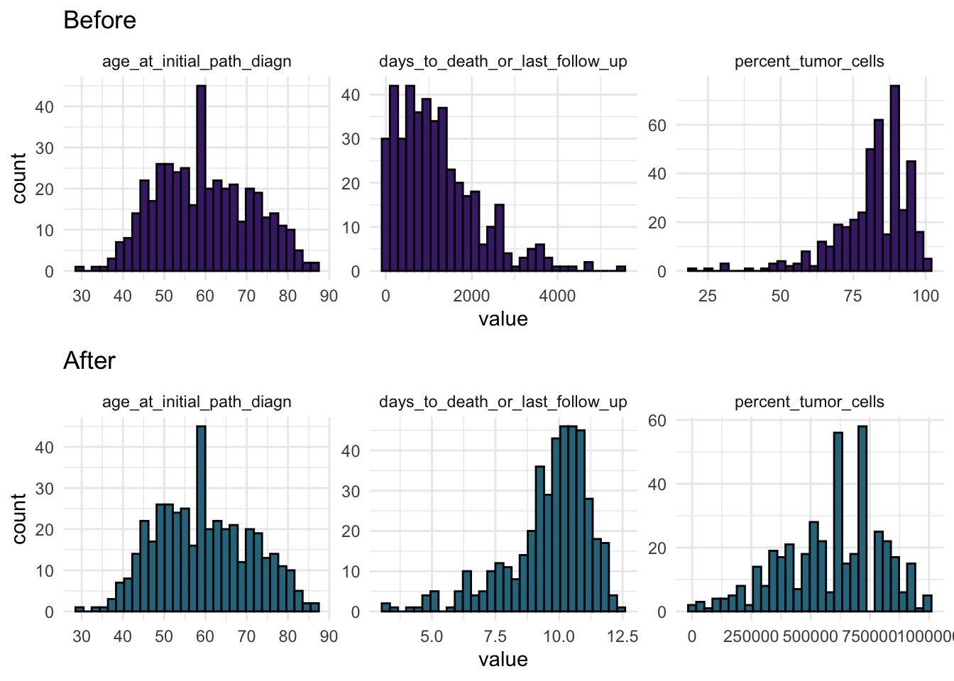
This gives a visual check of whether the transformed variables are less skewed and more comparable in shape.
Applying Z-Score Scaling
Because these variables are often measured on different scales/units, we often have to apply z-score scaling before multivariate analysis so that no single variable dominates only because of its range.
p1 <- df_comb %>%
  select(where(is.double)) %>%
  drop_na() %>%
  pivot_longer(everything(),
               names_to = "Sample",
               values_to = "Value") %>%
  ggplot(aes(x = Sample, y = Value, fill = Sample)) +
  geom_boxplot() +
  theme_minimal() +
  labs(title = "Boxplot: raw") +
  theme(legend.position = "none",
        axis.text.x = element_text(angle = 90, vjust = 0.5)) +
  scale_fill_viridis_d()

p2 <- as.tibble(scale(df_comb %>%
                        select(where(is.double)) %>%
                        drop_na())) %>%
  pivot_longer(everything(),
               names_to = "Sample",
               values_to = "Value")  %>%
  ggplot(aes(x = Sample, y = Value, fill = Sample)) +
  geom_boxplot() +
  theme_minimal() +
  labs(title = "Scaled (Z-score)") +
  theme(legend.position="none",
        axis.text.x = element_text(angle = 90, vjust = 0.5)) +
  scale_fill_viridis_d()

ggarrange(p1, p2, nrow = 1)
Here, we visualize the effect of z-score scaling.
Gene Expression Data Are Special
Now that we have explored the clinical variables, we turn to the collagen gene expression values.
RNA-seq count data differ from ordinary clinical variables because genes with higher expression often also have higher variance. This mean-variance relationship makes simple transformations less effective when we want to compare genes fairly.
See Example image…
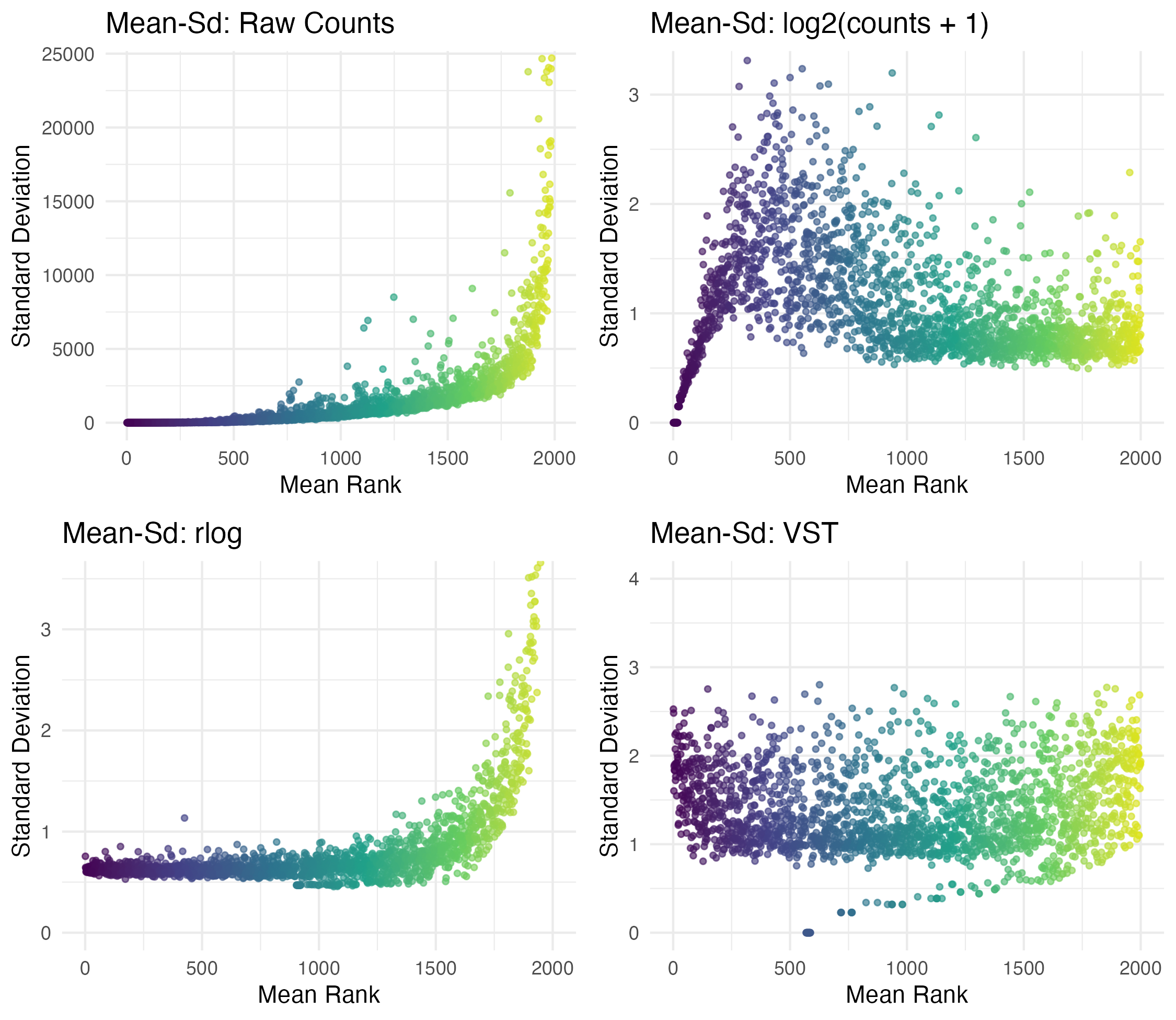
In this example we can see that log2 helps, but sometime here VST does a better job of flattening the sd/variance.
For this reason, RNA-seq workflows often use transformations designed specifically for count data, such as:
rlog()(regularized log transformation)varianceStabilizingTransformation()(VST)
These advanced tools, available in the DESeq2 package, are specifically designed for stabilizing variance in count data.
VST Transformations
We will proceed using the VST-transformed data.
df_matrix <- df_comb %>%
  #select(where(is.integer))  %>%
  select(starts_with('COL')) %>%
  as.matrix()

#Create variance stabilized versions
vst_df  <- varianceStabilizingTransformation(df_matrix+1, blind = TRUE)
Let’s inspect how the transformations affect overall data spread:
# Function for boxplot
plot_box <- function(mat, title) {
  df_long <- as.data.frame(mat) %>%
    pivot_longer(everything(), names_to = "Sample", values_to = "Expression")

  ggplot(df_long, aes(x = Sample, y = Expression, fill = Sample)) +
    geom_boxplot() +
    theme_minimal() +
    labs(title = title) +
    theme(legend.position="none",
          axis.text.x = element_text(angle = 90, vjust = 0.5)) +
    scale_fill_viridis_d()
}

# Generate plots
p1 <- plot_box(log2(df_matrix+1), "Boxplot: log2")
p2 <- plot_box(vst_df, "Boxplot: VST")

# Arrange and display plots
ggarrange(p1, p2, nrow = 2)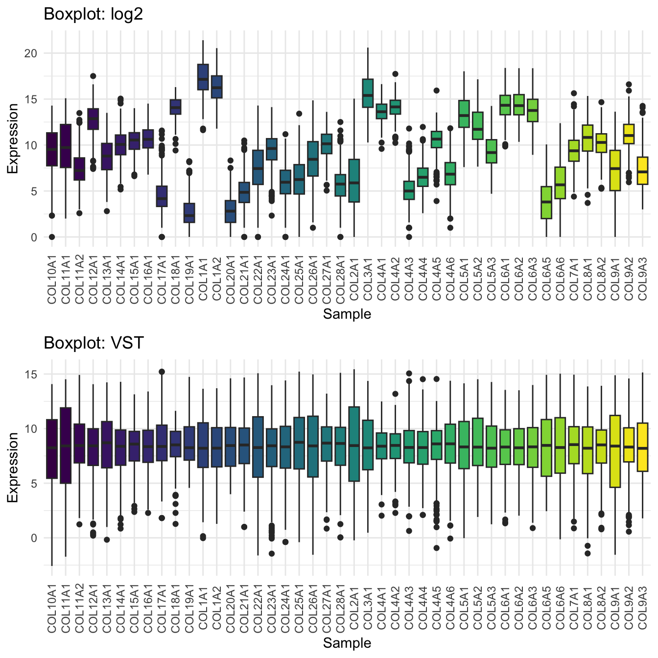
Caution: Transformations Are Not a Cure-All
Not every issue is solvable with a transformation
Consider non-linear models or weighted least squares when appropriate
Interpret results on the transformed scale, but report findings on the original scale when possible
Best Practice: Try multiple transformations and assess both statistical fit and interpretability.
Principal Component Analysis (PCA)
Now that the gene expression data have been variance-stabilized, we can run PCA to identify the main axes of variation across samples.
Here, PCA is performed on the transformed collagen expression matrix, while clinical variables are used afterward to help interpret the resulting patterns.
There are many frameworks for performing PCA in R. Here, we’ll use the FactoMineR and factoextra packages to compute and visualize PCA results.
Since PCA is sensitive to scale and variance, it’s important to use the cleaned and transformed data we prepared earlier.
PCA on VST-Stabilized Data
Let’s run the PCA:
# Compute PCA
res.pca_genes_vst  <- PCA(vst_df, graph = FALSE, scale.unit = TRUE)
res.pca_genes_vst
**Results for the Principal Component Analysis (PCA)**
The analysis was performed on 427 individuals, described by 44 variables
*The results are available in the following objects:
name description
1 "$eig" "eigenvalues"
2 "$var" "results for the variables"
3 "$var$coord" "coord. for the variables"
4 "$var$cor" "correlations variables - dimensions"
5 "$var$cos2" "cos2 for the variables"
6 "$var$contrib" "contributions of the variables"
7 "$ind" "results for the individuals"
8 "$ind$coord" "coord. for the individuals"
9 "$ind$cos2" "cos2 for the individuals"
10 "$ind$contrib" "contributions of the individuals"
11 "$call" "summary statistics"
12 "$call$centre" "mean of the variables"
13 "$call$ecart.type" "standard error of the variables"
14 "$call$row.w" "weights for the individuals"
15 "$call$col.w" "weights for the variables" Eigenvalues and Variance Explained
Next, we’ll check how much variance each principal component explains and visualize the results!
fviz_screeplot(res.pca_genes_vst, addlabels = TRUE, ylim = c(0, 45))
The first few principal components typically capture most of the structured variation in the data, while later components explain progressively less. This helps decide how many components to keep.
~50% of the informations (variances) contained in the data are retained by the first two principal components.
Variable-Level PCA Results
We can extract variable-level PCA results with:
var <- get_pca_var(res.pca_genes_vst)
var
Principal Component Analysis Results for variables
===================================================
Name Description
1 "$coord" "Coordinates for the variables"
2 "$cor" "Correlations between variables and dimensions"
3 "$cos2" "Cos2 for the variables"
4 "$contrib" "contributions of the variables" To identify which genes are best represented on each axis, we can inspect their cos2 values:
p1 <- fviz_cos2(res.pca_genes_vst, choice = "var", axes = 1, top=15) # cos2 = quality
p2 <- fviz_cos2(res.pca_genes_vst, choice = "var", axes = 2, top=15)
p3 <- fviz_cos2(res.pca_genes_vst, choice = "var", axes = 3, top=15)
p4 <- fviz_cos2(res.pca_genes_vst, choice = "var", axes = 4, top=15)

ggarrange(p1, p2, p3, p4,  nrow = 2, ncol = 2)
This highlights which genes contribute most strongly to each principal component and which genes are best represented by the PCA space.
We can also plot the variable map and label selected top genes.
loadings_df <- as.data.frame(res.pca_genes_vst$var$coord)
loadings_df$gene <- rownames(loadings_df)

top_genes <- c(
  loadings_df %>% arrange(desc(abs(Dim.1))) %>% slice_head(n = 5) %>% pull(gene),
  loadings_df %>% arrange(desc(abs(Dim.2))) %>% slice_head(n = 5) %>% pull(gene),
  loadings_df %>% arrange(desc(abs(Dim.3))) %>% slice_head(n = 1) %>% pull(gene),
  loadings_df %>% arrange(desc(abs(Dim.4))) %>% slice_head(n = 1) %>% pull(gene)
) %>% unique()
top_genes
[1] "COL5A1" "COL1A1" "COL6A3" "COL5A2" "COL1A2" "COL2A1" "COL9A3"
[8] "COL20A1" "COL11A2" "COL4A6" "COL9A1" "COL4A4" # Color by cos2 values: quality on the factor map
fviz_pca_var(res.pca_genes_vst,
col.var = "cos2",
select.var = list(name = top_genes),
repel = TRUE # Avoid text overlapping
) +
scale_color_viridis_c(option = "D")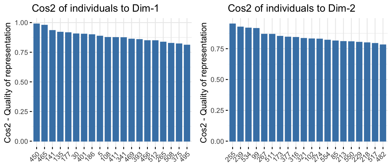
Variables closer to the circle’s edge are well represented and more influential. Variables pointing in similar directions tend to be positively correlated, while variables pointing in opposite directions tend to be negatively correlated.
Gene Expression Patterns on PCA Projection
We can also color samples by the expression of selected genes:
p1 <- fviz_pca_ind(
  res.pca_genes_vst,
  col.ind = vst_df[, "COL5A1"],
  geom = "point",
  title = "COL5A1"
) + scale_color_viridis_c()

p2 <- fviz_pca_ind(
  res.pca_genes_vst,
  col.ind = vst_df[, "COL2A1"],
  geom = "point",
  title = "COL2A1"
) + scale_color_viridis_c()

ggarrange(p1, p2, ncol = 2, nrow = 1)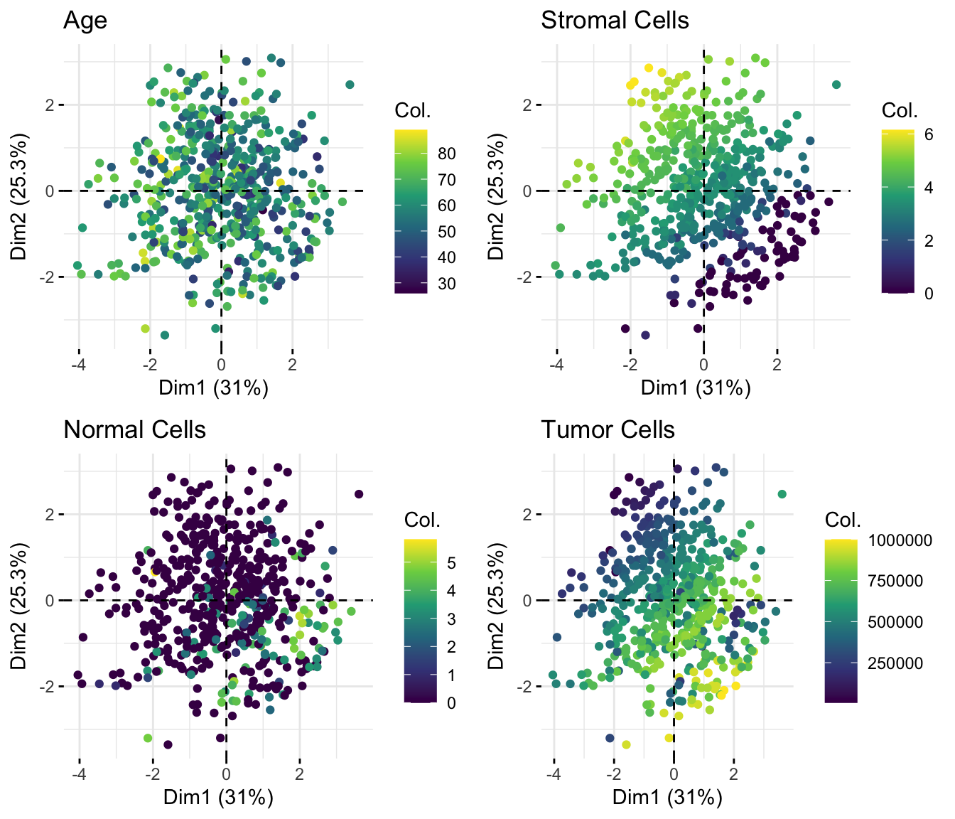
Observation: For example, COL5A1 and COL2A1 show distinct gradients across PCA space, suggesting that they contribute differently to the main axes of variation.
Coloring samples by continuous variables
We can also color samples by continuous clinical variables, such as stemness score, tumor cell percentage, and age at diagnosis. This helps us assess whether these sample-level variables align with the major axes of variation in collagen expression.
t1 <- fviz_pca_ind(
  res.pca_genes_vst,
  col.ind = df_scaled$stemness_score,
  geom = "point",
  title = "stemness_score"
) + scale_color_viridis_c(option = "C")

t2 <- fviz_pca_ind(
  res.pca_genes_vst,
  col.ind = df_scaled$age_at_initial_path_diagn,
  geom = "point",
  title = "age_at_initial_path_diagn"
) + scale_color_viridis_c(option = "C")

ggarrange(t1, t2, ncol = 2, nrow = 1)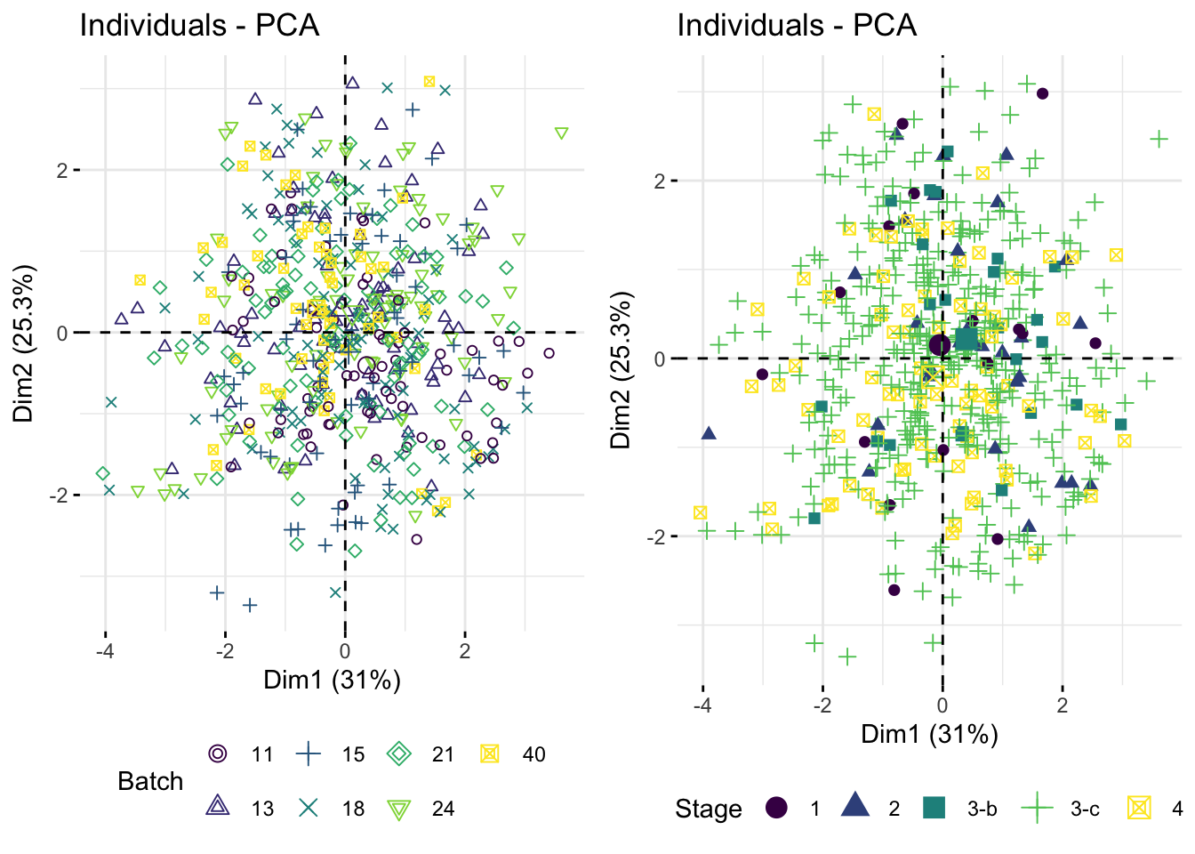
Coloring samples by groups (Factors)
We can also color samples by categorical variables, such as tissue source site, stage or grade category, to see whether known groups separate in PCA space.
group_var <- df_comb %>%
  select(where(is.factor))

p <- fviz_pca_ind(
  res.pca_genes_vst,
  col.ind = group_var$tissue_source_site,
  geom = "point",
  legend.title = "tissue_source_site",
  pointsize = 2
) +
  scale_color_viridis_d(option = "C") +
  theme(legend.position = "right")
p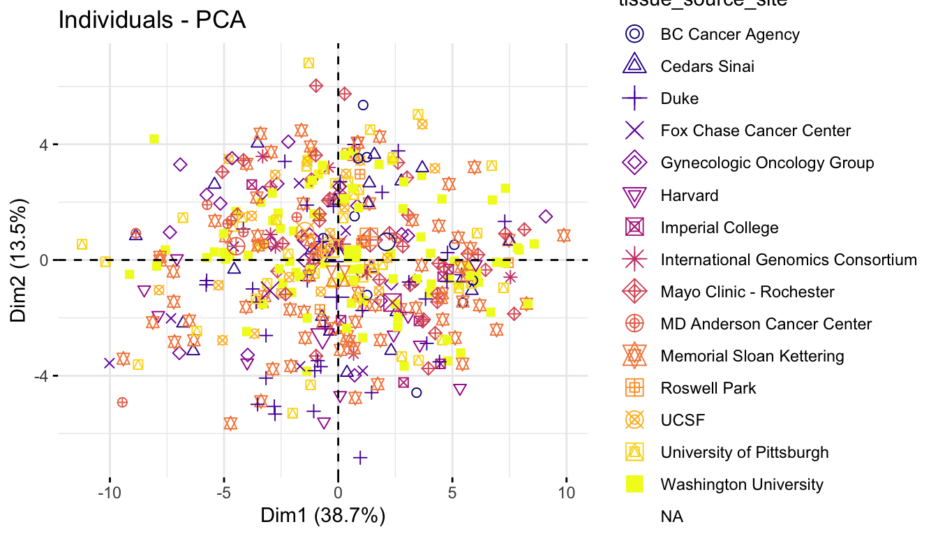
p1 <- fviz_pca_ind(
  res.pca_genes_vst,
  col.ind = group_var$figo_stage,
  geom = "point",
  legend.title = "figo_stage",
  pointsize = 2) +
  scale_color_viridis_d(option = "C") +
  theme(legend.position = "bottom")

p2 <- fviz_pca_ind(
  res.pca_genes_vst,
  col.ind = group_var$summarygrade,
  geom = "point",
  legend.title = "summarygrade",
  pointsize = 2) +
  scale_color_viridis_d(option = "C") +
  theme(legend.position = "bottom")

ggarrange(p1, p2, ncol = 2, nrow = 1)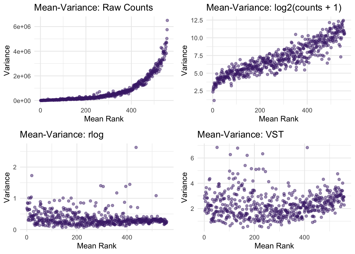
Individual-Level Results
Beyond looking at variables, PCA also provides insights at the individual level (i.e., each sample or patient). You can access their coordinates, cos2 values, and contributions.
# Extract individual results
ind <- get_pca_ind(res.pca_genes_vst)
ind
Principal Component Analysis Results for individuals
===================================================
Name Description
1 "$coord" "Coordinates for the individuals"
2 "$cos2" "Cos2 for the individuals"
3 "$contrib" "contributions of the individuals"To see which individuals contribute most to the main axes, plot their contributions. (same as for variables):
# Quality of representation (cos²) for individuals
p1 <- fviz_cos2(res.pca_genes_vst, choice = "ind", axes = 1, top = 15)
p2 <- fviz_cos2(res.pca_genes_vst, choice = "ind", axes = 2, top = 15)
ggarrange(p1, p2, nrow = 1, ncol = 2)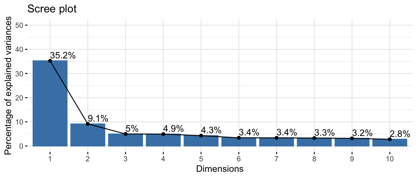
This highlights samples that are particularly influential or well represented along the main PCA axes.
Results: Investigating Collagen Genes and Tumor Characteristics
We set out to explore whether the collagen gene family plays an important role in ovarian cancer, and whether tumor composition or sample-level characteristics help explain the major patterns in collagen expression.
To summarize the PCA results, we first identify the genes with the largest absolute loadings on the first two principal components:
# Top genes from PC1 and PC2
top_genes <- c(
  loadings_df %>% arrange(desc(abs(Dim.1))) %>% slice_head(n = 1) %>% pull(gene),
  loadings_df %>% arrange(desc(abs(Dim.2))) %>% slice_head(n = 1) %>% pull(gene)
) %>% unique()
top_genes
[1] "COL5A1" "COL2A1"hese genes contribute strongly to the first two principal components and therefore capture important expression patterns in the dataset.
Gene Expression by Cancer Stage
We next visualized the expression of these genes across cancer stages to see if their expression correlates with disease progression.
df_long <- df_comb %>%
  select(any_of(top_genes), figo_stage) %>%
  pivot_longer(cols = any_of(top_genes),
               names_to = "gene",
               values_to = "value")

ggplot(df_long, aes(x = gene, y = log2(value+1), fill = figo_stage)) +
  geom_boxplot() +
  scale_fill_viridis_d() +
  theme_minimal() +
  facet_wrap(vars(gene), nrow = 1, scales = "free") +
  labs(title = "Gene Expression by Tumor Stage")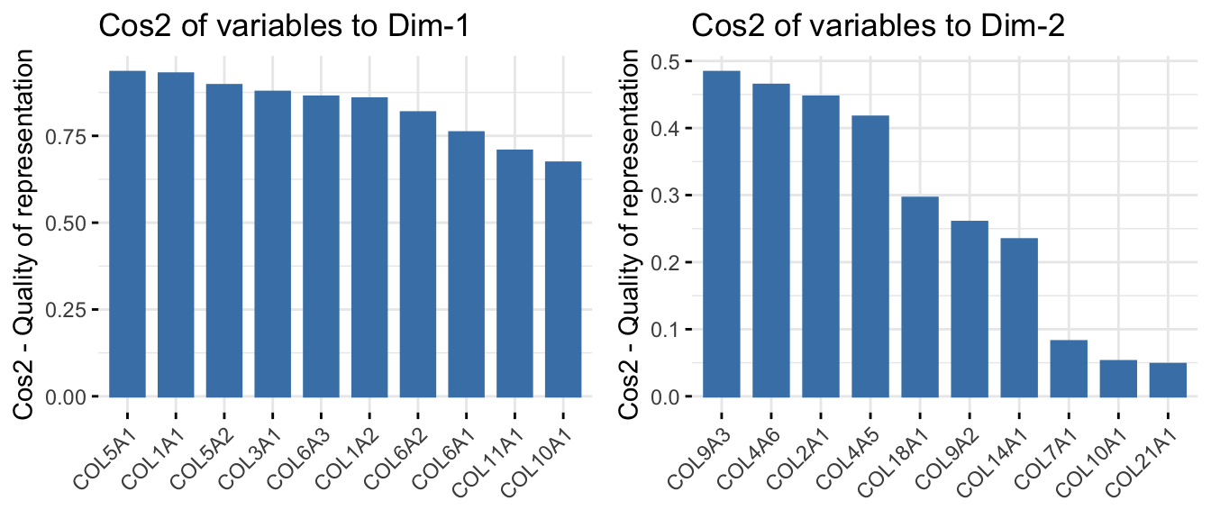
These boxplots allow us to assess whether genes that are important in PCA also show systematic differences across clinical stage.
If one of the top genes increases in later-stage tumors, that suggests the associated PCA axis may partly reflect disease progression.
If expression remains similar across stages, the component may instead reflect other biological or technical factors.
Gene Expression vs. Tumor Composition and Stemness score
We can also examine whether the top-loading genes relate to tumor or stromal composition — key features of the tumor microenvironment. We can extend the same idea to stemness score.
df_long <- df_comb %>%
  select(any_of(top_genes),
         percent_tumor_cells,
         percent_stromal_cells,
         stemness_score) %>%
  pivot_longer(cols = any_of(top_genes),
               names_to = "gene",
               values_to = "value")
p1 <- ggplot(df_long,
aes(x = log2(percent_stromal_cells + 1),
y = log2(value+1),
color = percent_tumor_cells^3)) +
geom_point(alpha = 0.5) +
scale_color_viridis_c() +
theme_minimal() +
stat_smooth(method = "loess", col = "red", span = 2) +
facet_wrap(vars(gene), ncol = 2, scales = "free") +
stat_cor(method = "pearson", p.accuracy = 0.001, r.accuracy = 0.001) +
labs(title = "Expression vs. Stromal Cell Composition") +
theme(legend.position = "none")These plots help us assess whether collagen expression is associated with tumor-cell proportion, stromal content, or both.
p2 <- ggplot(df_long,
             aes(x = stemness_score,
                 y = log2(value+1),
                 color = log2(percent_stromal_cells + 1))) +
  geom_point(alpha = 0.5) +
  scale_color_viridis_c() +
  theme_minimal() +
  stat_smooth(method = "loess", col = "red", span = 2) +
  facet_wrap(vars(gene), ncol = 4, scales = "free") +
  stat_cor(method = "pearson", p.accuracy = 0.001, r.accuracy = 0.001) +
  labs(title = "Expression vs. stemness_score ") +
theme(legend.position = "none") ggpubr::ggarrange(p1, p2, ncol = 1, nrow = 2)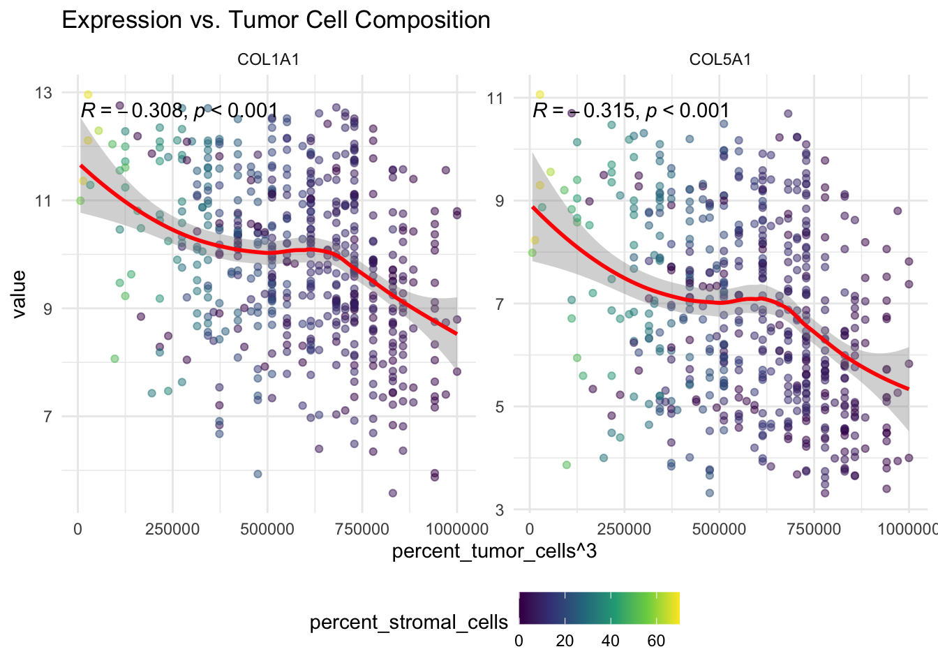
If one of the top genes shows a negative relationship with stemness score, that may suggest that the corresponding PCA axis is linked to broader tumor composition or differentiation patterns rather than only to tumor stage.
Summary of key results
PCA helped us identify the collagen genes that contribute most strongly to the main axes of variation in the dataset.
From these exploratory analyses, we can tentatively conclude the following:
The first principal components capture meaningful variation in collagen expression.
Some top-loading genes vary with tumor stage.
Several of these genes also appear related to tumor composition, especially stromal and tumor-cell proportions.
Associations with stemness score may reflect broader microenvironmental or compositional effects.
Working hypothesis: These results are exploratory, but they suggest that collagen expression in ovarian cancer may reflect both tumor progression, such as stage, and the cellular composition of the sample, particularly stromal and CAF content, with some collagen genes following distinct patterns.
Adjusting for cell composition will be essential in downstream analyses. Further statistical modeling will be needed.