outlier <- tibble(Age = max(diabetes_glucose_num$Age) + 5,
                  BloodPressure = max(diabetes_glucose_num$BloodPressure) + 5,
                  BMI = max(diabetes_glucose_num$BMI) + 5,
                  PhysicalActivity = max(diabetes_glucose_num$PhysicalActivity) + 5,
                  Serum_ca2 = max(diabetes_glucose_num$Serum_ca2) + 5,
                  `Glucose (mmol/L)` = max(diabetes_glucose_num$`Glucose (mmol/L)`) + 5,
                  )

# Add a new row
diabetes_glucose_num_outlier <- add_row(diabetes_glucose_num, outlier)

# Keep adding outliters
# diabetes_glucose_num_outlier <- add_row(diabetes_glucose_num_outlier, outlier)Exercise 2: Summary Statistics and Data Wrangling
Introduction
In this exercise you will do some more advance tidyverse operations such as pivoting and nesting.
First steps
Load packages.
Load the joined diabetes data set you created in exercise 1 (e.g. “diabetes_join.xlsx”) and the glucose dataset
df_glucose.xlsxfrom the data folder. If you did not make it all the way through exercise 1 you can find the dataset you need indata/exercise1_diabetes_join.xlsx
Change format
Have a look at the df_glucose dataset. It has three columns with measurements from a Oral Glucose Tolerance Test where blood glucose is measured at fasting (Glucose_0), 1 hour/60 mins after glucose intake (Glucose_6), and 2 hours/120 mins after (Glucose_120). The last columns is an ID column.
Change the data type of the ID column to
factorin the glucose dataset.Restructure the glucose dataset into a long format. Name/rename the value column to
Glucose (mmol/L)and the column that describes the measurement time toMeasurement. Check the resulting dataset.How many rows are there per ID? Does that make sense?
Change factor levels
- In your long formatted dataframe you should have one column that described which measurement the row refers to, i.e. Glucose_0, Glucose_60 or Glucose_120. Transform this column so you only have the numerical part, i.e. only 0, 60 or 120. Then change the data type of that column to
factor. Check the order of the factor levels and if necessary change them to the proper order.
TipHint
Have a look at the help for factors ?factors to see how to influence the levels.
Join datasets
- Using
left_join(), join the (I) diabetes dataset you loaded in 2 with (II) the long formatted glucose dataset you created in 4. Do the wrangling needed to make it happen.
TipHint
You will need to modify the ID column in one of the datasets.
Summary stats
- Calculate the mean glucose levels for each time point.
TipHint
You will need to use group_by() and summerise().
Make a figure with boxplots of the glucose measurements across the three time points.
Calculate mean and standard deviation for all numeric columns and reformat the data frame into a manageable format like we did in the presentation.
TipHint
You will need to use summarise() and across() to select numeric columns.
For a nice reformatting like in the presentation with need both pivot_longer and pivot_wider.
Plot
PhysicalActivityandBMIagainst each other in a scatter plot and color byGlucose (mmol/L).Highlights any trends or patterns that emerge across
PhysicalActivityandBMIvalues. Includes an indication of confidence around those trends. Change color palette.
Sample outliers across variables
- Just like we did in the presentation, make a histogram for each numeric variable in the dataset. You can copy-paste the code from the presentation and make very few changes to make it work in this case.
TipHint
Check the class of the variables in the dataset.
- Check for outlier samples using the dendogram showed in the presentation. This includes scaling, calculating the distances between all pairs of scaled variables and hierarchical clustering. Remember that this can only be done for the numeric variables.
We will not spot any outliers via the dendogram in this dataset so we will add a fake outlier for you to detect. Here, the outlier has a value of the maximum value + 5 in each of the variables - pretty unrealistic. Play around with the values of the fake outlier and see how extreme it needs to be to be spotted in the dendogram.
- Export the final dataset (without the outlier) in whichever format you prefer.
More Plotting
Let’s make some more advanced ggplots!
- For p1, plot the density of the glucose measurements at time 0. For p2, make the same plot as p1 but add stratification on the diabetes status. Make sure Diabetes is a factor. Give the plot a meaningful title. Consider the densities - do the plots make sense?
p1 <- # code for plot 1

p2 <- # code for plot 2

library(patchwork)
p1 + p2 + plot_annotation(title = "Glucose measurements at time 0")
Now, create one plot for the glucose measurement where the densities are stratified on measurement time (0, 60, 120) and diabetes status (0, 1). You should see 6 density curves in your plot.
That is not a very intuitive plot. Could we change the geom and the order of the variables to visualize the same information more intuitively?
TipHint
There two ways of stratifying a density plot in ggplot2: color and linetype.
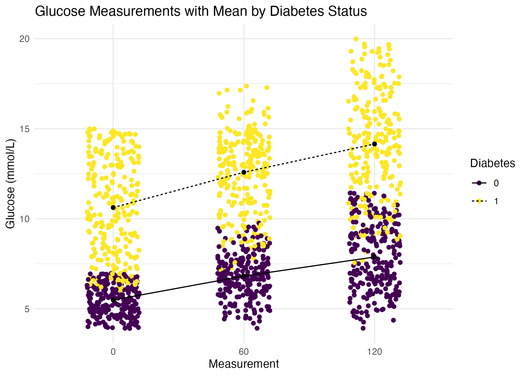
- Calculate mean Glucose level by time point and
Diabetesstatus. Save the data frame in a variable.
TipHint
Group by several variables: group_by(var1, var2).
Create a plot that visualizes glucose measurements across time points, with one line for each patient ID. Then color the lines by their diabetes status. In summary, each patient’s glucose measurements should be connected with a line, grouped by their ID, and color-coded by
Diabetes. Give the plot a meaningful title.Recreate the plot you made above. But this time: Jittered individual values to avoid over plotting. Overlay and connect the group means showing the mean trend for each group. Add a title, change color pallet and themes.
This plot should look like this: