library(tidyverse)Exercise 3 A - Solutions
Getting started
- Load packages.
- Load data from the
.rdsfile you created in Exercise 2. Have a guess at what the function is called.
diabetes_glucose <- read_rds('../out/diabetes_glucose.rds')
head(diabetes_glucose)
# A tibble: 6 × 12
ID Sex Age BloodPressure BMI PhysicalActivity Smoker Diabetes
<fct> <chr> <dbl> <dbl> <dbl> <dbl> <chr> <chr>
1 9046 Male 34 84 24.7 93 Unknown 0
2 51676 Male 25 74 22.5 102 Unknown 0
3 60182 Male 50 80 34.5 98 Unknown 1
4 1665 Female 27 60 26.3 82 Never 0
5 56669 Male 35 84 35 58 Smoker 1
6 53882 Female 31 78 43.3 59 Smoker 1
# ℹ 4 more variables: Serum_ca2 <dbl>, Married <chr>, Work <chr>, OGTT <list>Plotting - Part 1
You will first do some basic plots to get started with ggplot again.
If it has been a while since you worked with ggplot, have a look at the ggplot material from the FromExceltoR course.
- Create a scatter plot of
AgeandBlood Pressure. Do you notice a trend?
diabetes_glucose %>%
  ggplot(aes(x = BloodPressure,
             y = Age)) +
  geom_point()
Warning: Removed 2 rows containing missing values or values outside the scale range
(`geom_point()`).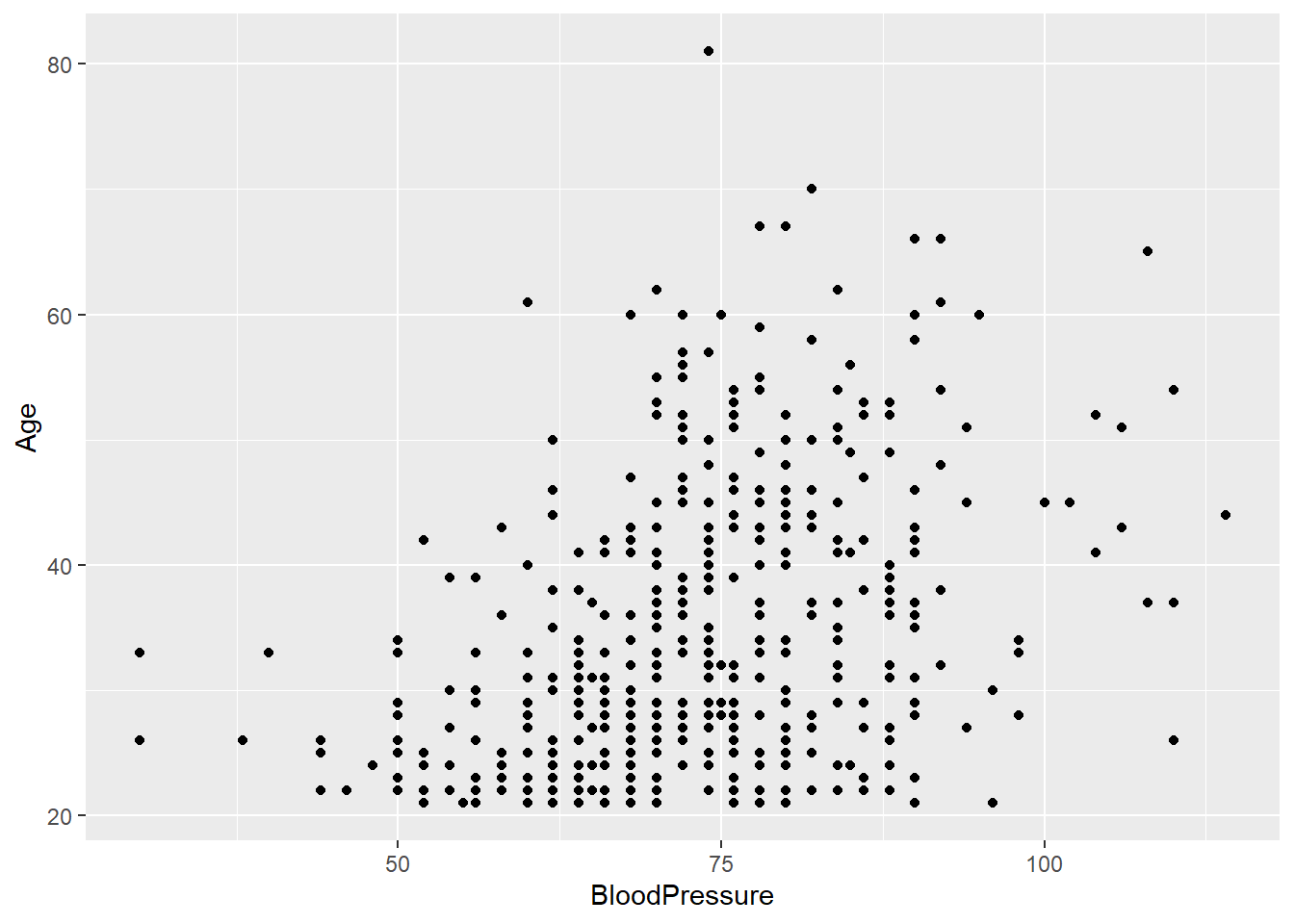
- Create a scatter plot of
PhysicalActivityandBMI.Do you notice a trend?
diabetes_glucose %>%
  ggplot(aes(x = PhysicalActivity,
             y = BMI)) +
geom_point() 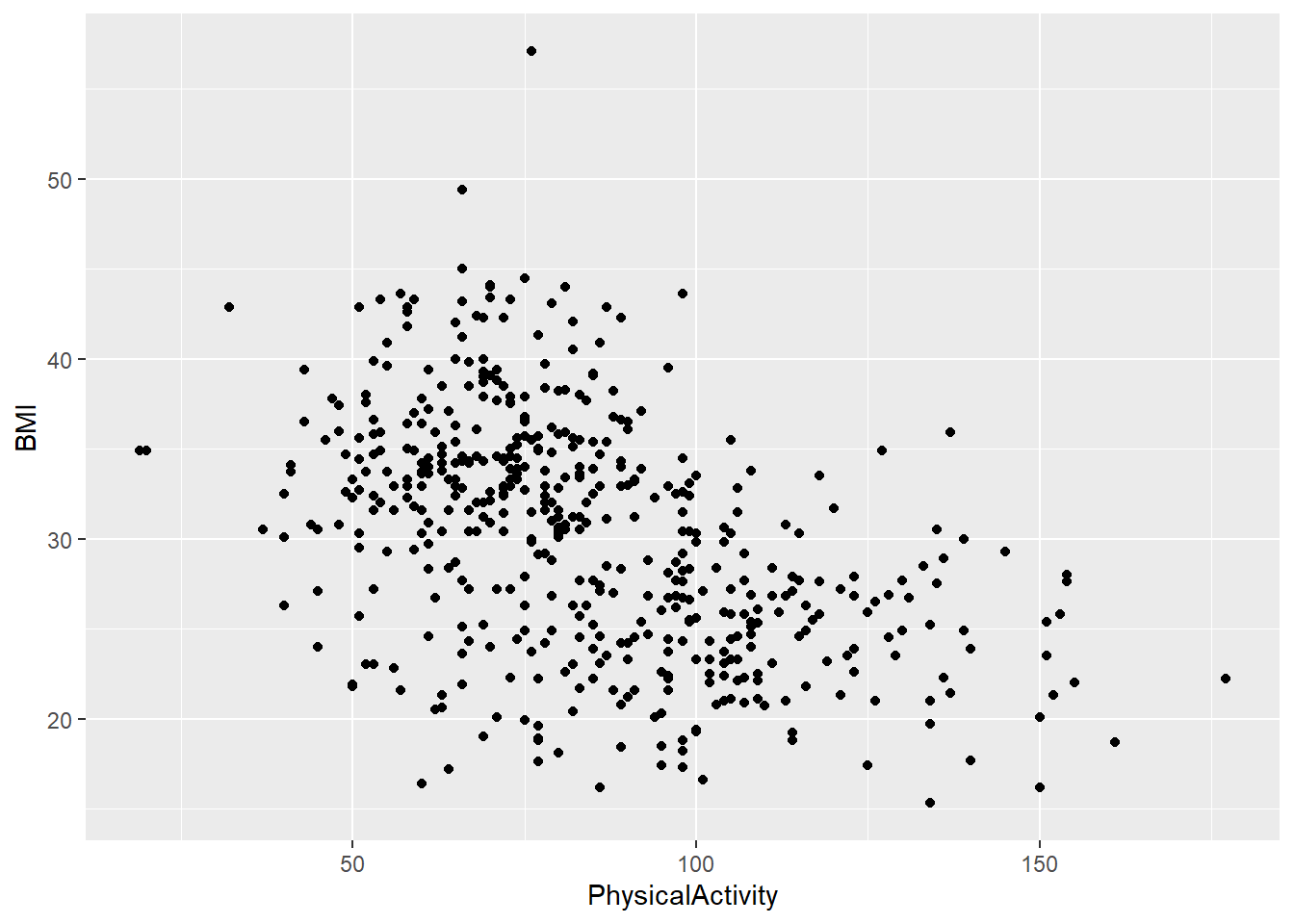
- Now, create the same two plots as before, but this time stratify them by
Diabetes. Do you notice any trends?
Hint
You can stratify a plot by a categorical variable in several ways, depending on the type of plot. The purpose of stratification is to distinguish samples based on their categorical values, making patterns or differences easier to identify. This can be done using aesthetics like color, fill, shape.
diabetes_glucose %>%
  ggplot(aes(x = BloodPressure,
             y = Age,
             color = Diabetes)) +
  geom_point()
Warning: Removed 2 rows containing missing values or values outside the scale range
(`geom_point()`).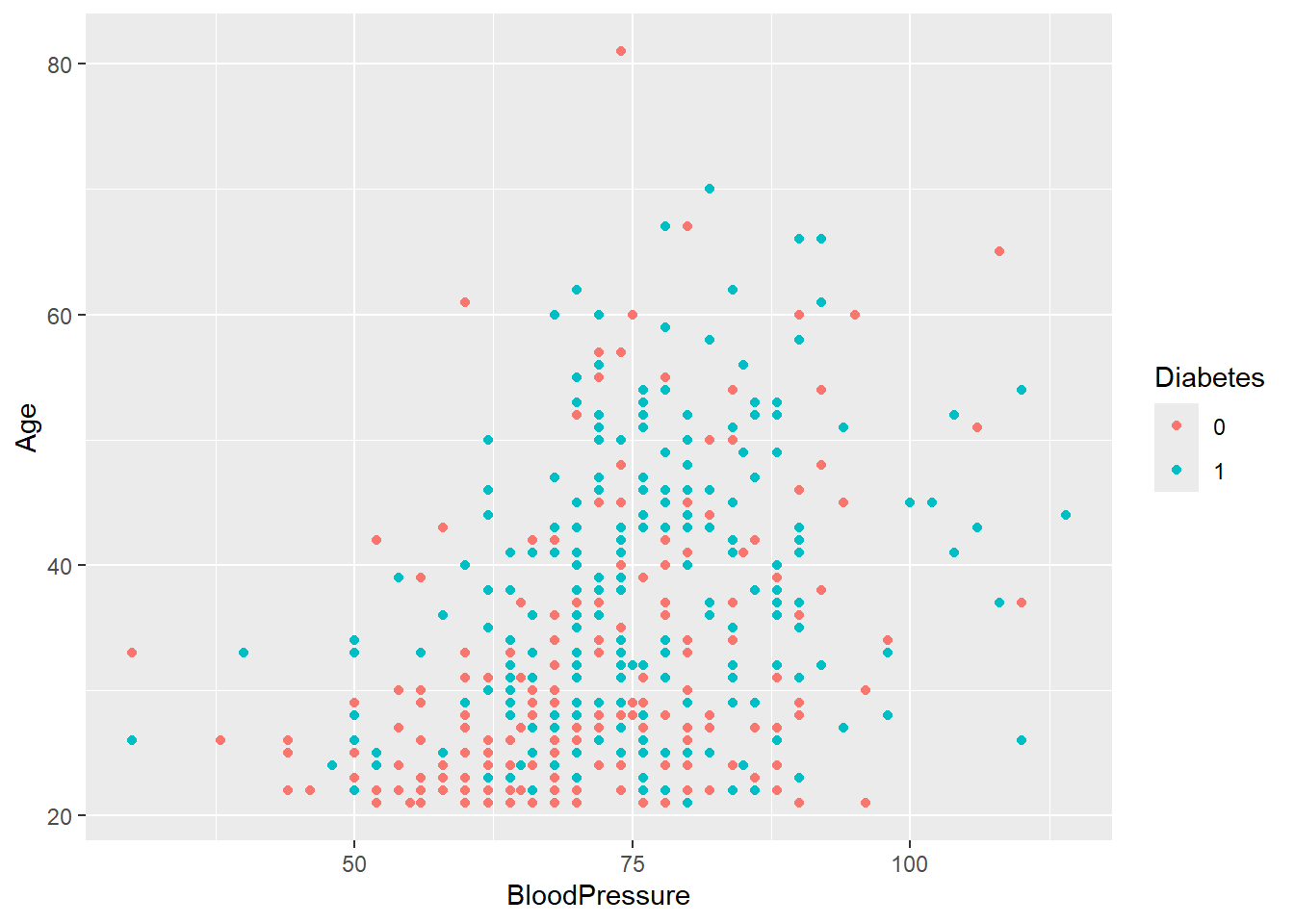
diabetes_glucose %>%
  ggplot(aes(x = PhysicalActivity,
             y = BMI,
             color = Diabetes)) +
geom_point() 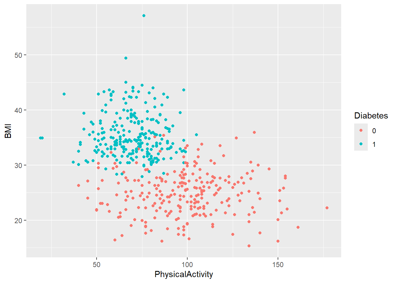
- Create a boxplot of
BMIstratified byDiabetes.Give the plot a meaningful title.
diabetes_glucose %>%
  ggplot(aes(y = BMI,
             x = Diabetes,
             color = Diabetes)) +
  geom_boxplot() +
  labs(title = 'Distribution of BMI Stratified by Diabetes')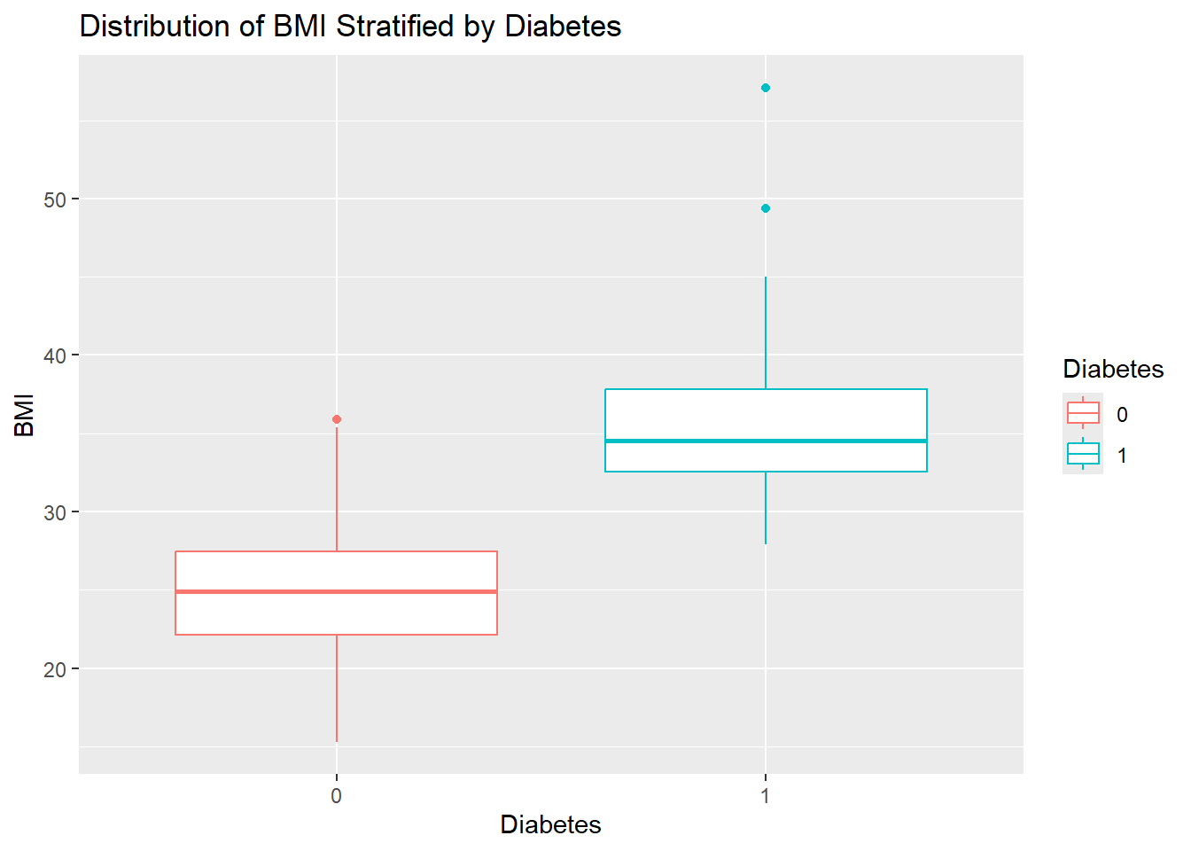
- Create a boxplot of
PhysicalActivitystratified bySmoker. Give the plot a meaningful title.
diabetes_glucose %>%
  ggplot(aes(y = PhysicalActivity,
             x = Smoker,
             fill = Smoker)) +
  geom_boxplot() +
  labs(title = 'Distribution of Physical Activity Stratified by Smoker Status')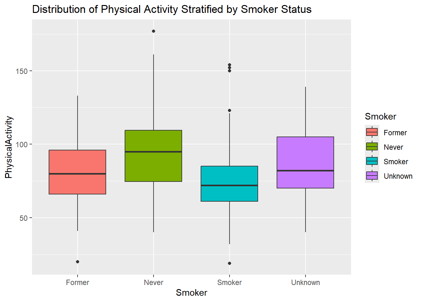
Plotting - Part 2
In order to plot the data inside the nested variable, the data needs to be unnested.
- Create a boxplot of the glucose measurements at time 0 stratified by
Diabetes. Give the plot a meaningful title.
diabetes_glucose %>%
  unnest(OGTT) %>%
  filter(Measurement == 0) %>%
  ggplot(aes(y = `Glucose (mmol/L)`,
             x = Diabetes,
             color = Diabetes)) +
  geom_boxplot() +
  labs(title = 'Glucose Measurement for Time Point 0 (fasted)')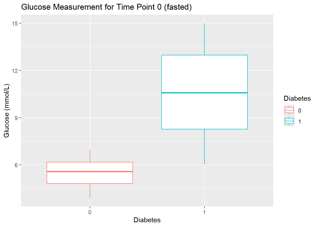
- Create these boxplots for each time point (0, 60, 120) by using faceting by
Measurement. Give the plot a meaningful title.
Hint
Faceting allows you to create multiple plots based on the values of a categorical variable, making it easier to compare patterns across groups. In ggplot2, you can use facet_wrap for a single variable or facet_grid for multiple variables.
diabetes_glucose %>%
  unnest(OGTT) %>%
  ggplot(aes(y = `Glucose (mmol/L)`,
             x = Diabetes,
             color = Diabetes)) +
  geom_boxplot() +
  facet_wrap(vars(Measurement)) +
  labs(title = 'Glucose Measurements for Time Point 0, 60, and 120')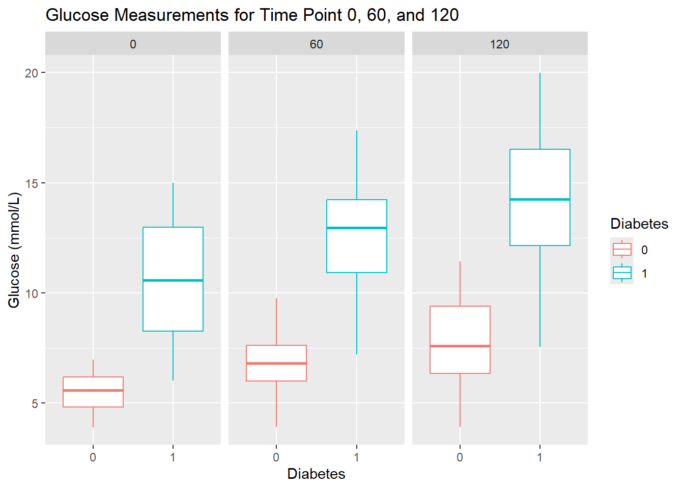
- Calculate the mean glucose levels for each time point.
Hint
You will need to use unnest(), group_by(), and summerise().
diabetes_glucose %>%
  unnest(OGTT) %>%
  group_by(Measurement) %>%
  summarise(`Glucose (mmol/L)` = mean(`Glucose (mmol/L)`))
# A tibble: 3 × 2
Measurement `Glucose (mmol/L)`
<fct> <dbl>
1 0 8.06
2 60 9.73
3 120 11.1 - Make the same calculation as above, but additionally group the results by
Diabetes. Save the data frame in a variable. Compare your results to the boxplots you made above.
Hint
Group by several variables: group_by(var1, var2).
glucose_mean <- diabetes_glucose %>%
  unnest(OGTT) %>%
  group_by(Measurement, Diabetes) %>%
  summarize(`Glucose (mmol/L)` = mean(`Glucose (mmol/L)`)) %>%
  ungroup()
`summarise()` has grouped output by 'Measurement'. You can override using the
`.groups` argument.glucose_mean# A tibble: 6 × 3
Measurement Diabetes `Glucose (mmol/L)`
<fct> <chr> <dbl>
1 0 0 5.50
2 0 1 10.6
3 60 0 6.83
4 60 1 12.6
5 120 0 7.89
6 120 1 14.2 - Create a plot that visualizes glucose measurements across time points, with one line for each patient ID. Then color the lines by their diabetes status. In summary, each patient’s glucose measurements should be connected with a line, grouped by their ID, and color-coded by
Diabetes. Give the plot a meaningful title.
If your time points are strangely ordered have a look at the levels of your Measurement variable (the one that specifies which time point the measurement was taken at) and if necessary fix their order.
diabetes_glucose %>%
  unnest(OGTT) %>%
  ggplot(aes(x = Measurement,
             y = `Glucose (mmol/L)`)) +
  geom_point(aes(color = Diabetes)) +
  geom_line(aes(group = ID, color = Diabetes)) +
  labs(title = 'Glucose Measurements Across Time Points by Diabetes Status')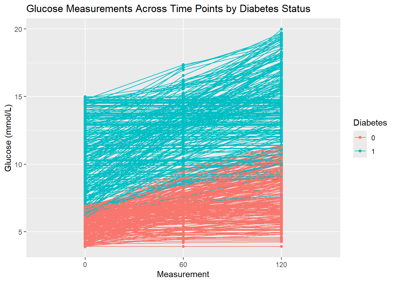
Extra
e1. Recreate the plot you made in Exercise 12 and include the mean value for each glucose measurement for the two diabetes statuses (0 and 1) you calculated in Exercise 11. This plot should look like this:

diabetes_glucose %>%
  unnest(OGTT) %>%
  ggplot(aes(x = Measurement,
             y = `Glucose (mmol/L)`)) +
  geom_point(aes(color = Diabetes)) +
  geom_line(aes(group = ID, color = Diabetes)) +
  geom_point(data = glucose_mean, aes(x = Measurement, y = `Glucose (mmol/L)`)) +
  geom_line(data = glucose_mean, aes(x = Measurement, y = `Glucose (mmol/L)`,
                                     group = Diabetes, linetype = Diabetes)) +
  labs(title = "Glucose Measurements with Mean by Diabetes Status")
ggsave('../out/figure3_13.png')Saving 7 x 5 in image