library(tidyverse)Warning: pakke 'ggplot2' blev bygget under R version 4.2.3Warning: pakke 'tibble' blev bygget under R version 4.2.3Warning: pakke 'dplyr' blev bygget under R version 4.2.3library(tidyverse)Warning: pakke 'ggplot2' blev bygget under R version 4.2.3Warning: pakke 'tibble' blev bygget under R version 4.2.3Warning: pakke 'dplyr' blev bygget under R version 4.2.3.rds file you created in Exercise 2. Have a guess at what the function is called.diabetes_glucose <- read_rds('../out/diabetes_glucose.rds')You will first do some basic plots to get started with ggplot again.
If it has been a while since you work with ggplot, have a look at the ggplot material from the FromExceltoR course: https://center-for-health-data-science.github.io/FromExceltoR/Presentations/presentation3.html.
Age and Blood Pressure. Do you notice a trend?diabetes_glucose %>%
ggplot(aes(x = BloodPressure,
y = Age)) +
geom_point() 
PhysicalActivity and BMI. Do you notice a trend?diabetes_glucose %>%
ggplot(aes(x = PhysicalActivity,
y = BMI)) +
geom_point() 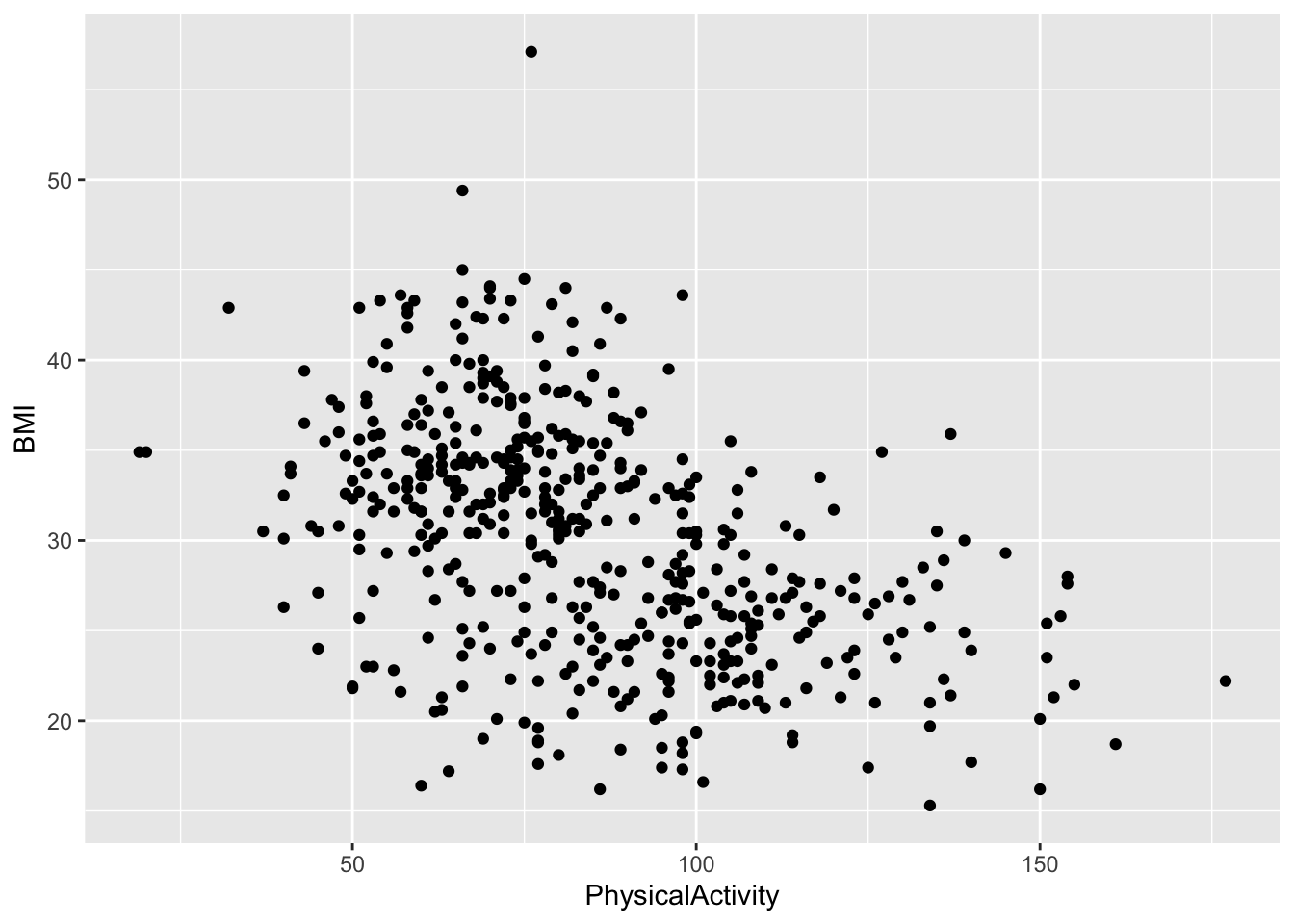
Diabetes. Do you notice any trends?You can stratify a plot by a categorical variable in several ways, depending on the type of plot. The purpose of stratification is to distinguish samples based on their categorical values, making patterns or differences easier to identify. This can be done using aesthetics like color, fill, shape.
diabetes_glucose %>%
  ggplot(aes(x = BloodPressure,
             y = Age,
             color = Diabetes)) +
  geom_point()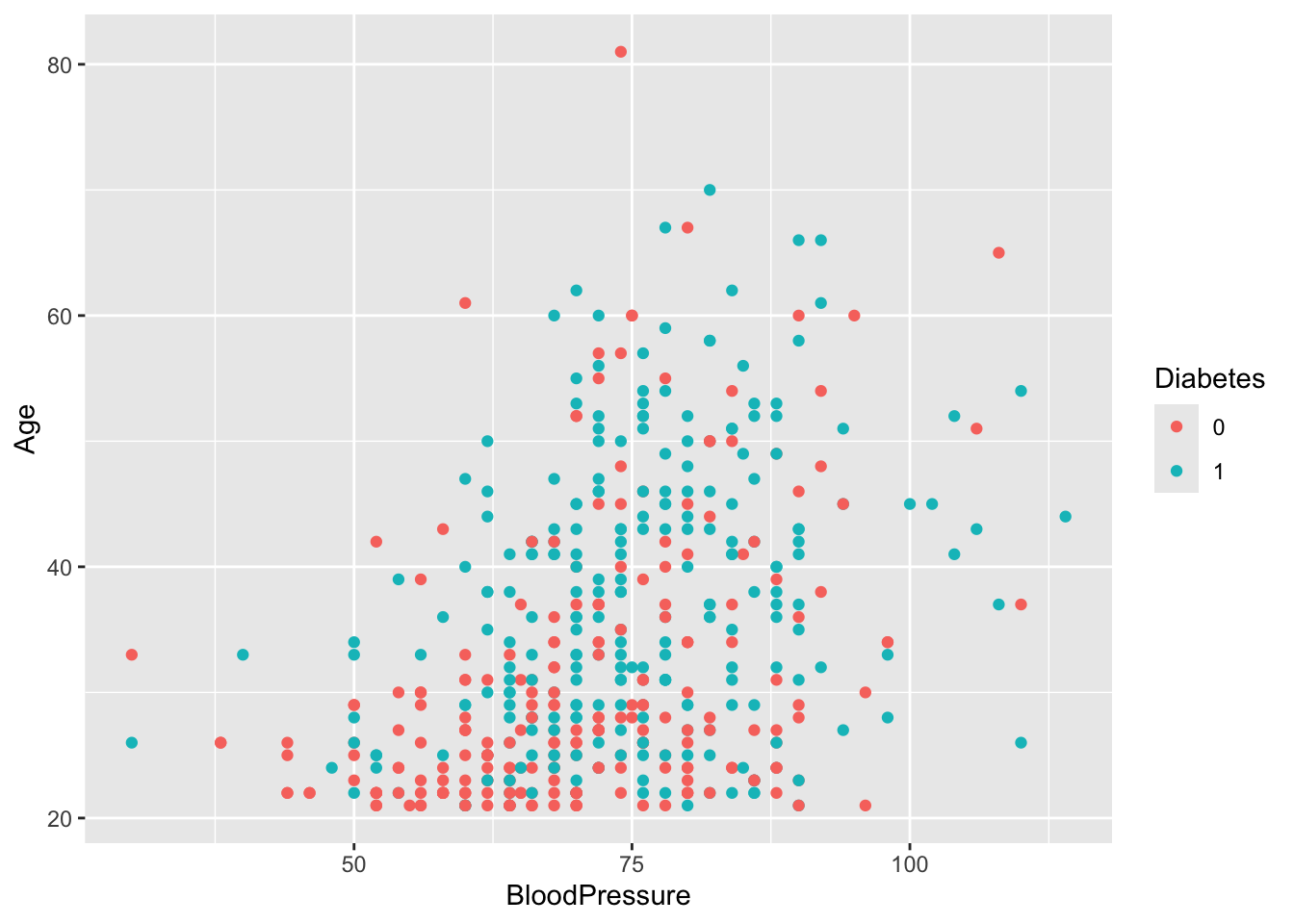
diabetes_glucose %>%
  ggplot(aes(x = PhysicalActivity,
             y = BMI,
             color = Diabetes)) +
geom_point() 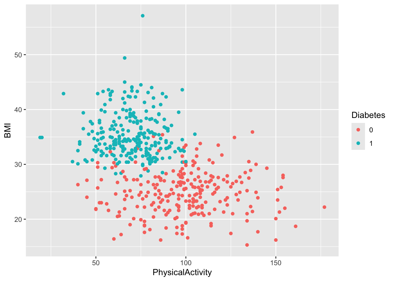
BMI stratified by Diabaetes. Give the plot a meaningful title.diabetes_glucose %>%
ggplot(aes(y = BMI,
x = Diabetes,
color = Diabetes)) +
geom_boxplot() +
labs(title = 'Distribution of BMI Stratified by Diabetes')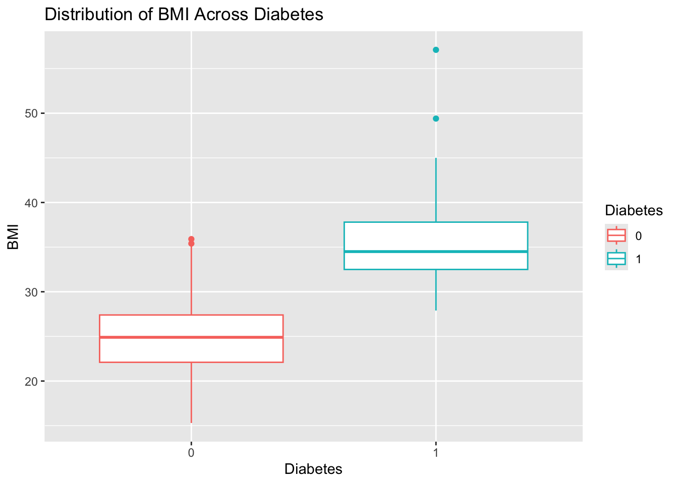
PhysicalActivity stratified by Smoker. Give the plot a meaningful title.diabetes_glucose %>%
ggplot(aes(y = PhysicalActivity,
x = Smoker,
fill = Smoker)) +
geom_boxplot() +
labs(title = 'Distribution of Physical Activity Stratified by Smoker Status')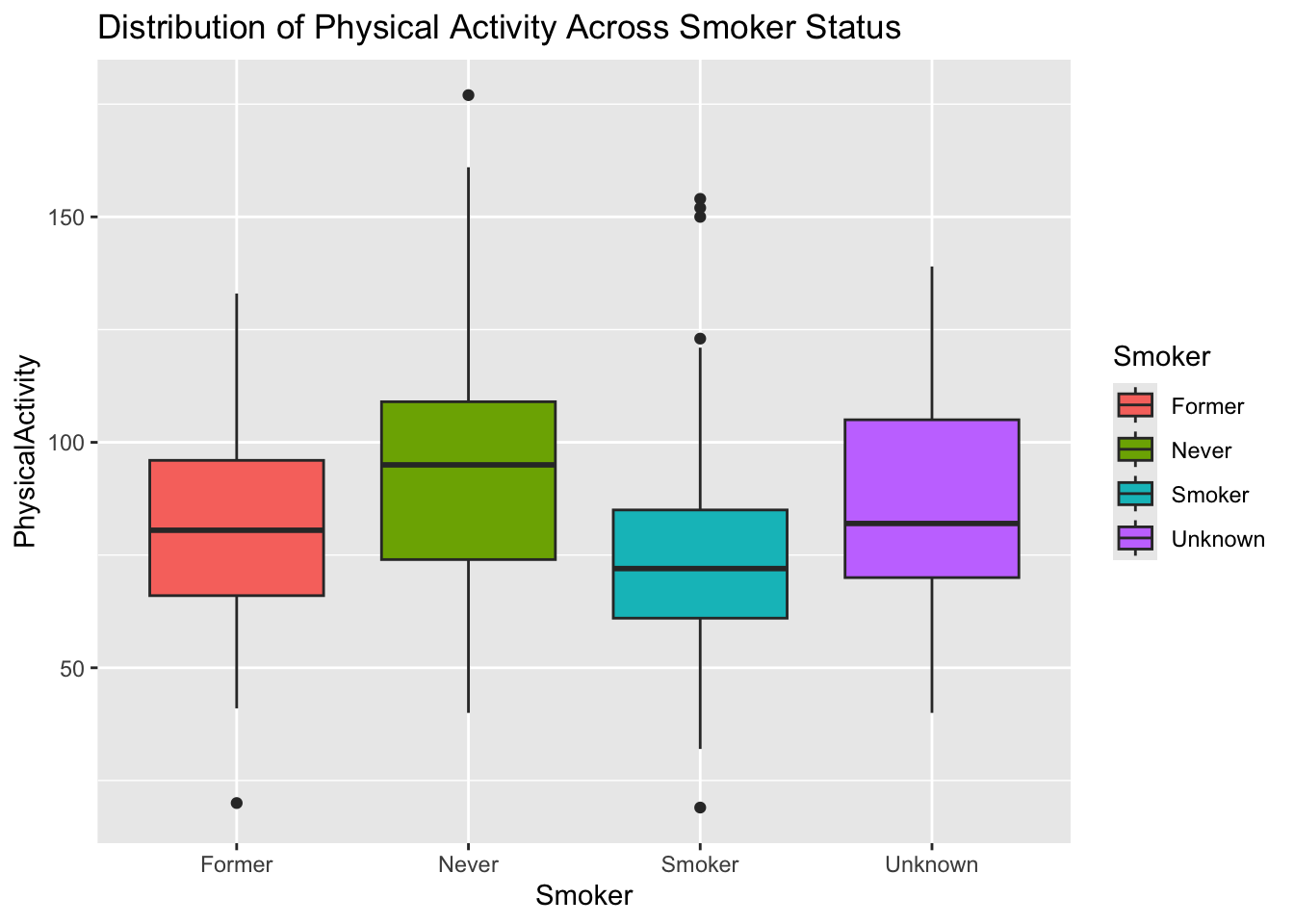
In order to plot the data inside the nested variable, the data needs to be unnested.
Diabetes. Give the plot a meaningful title.diabetes_glucose %>%
unnest(OGTT) %>%
mutate(Measurement = Measurement %>% as.factor()) %>%
filter(Measurement == 0) %>%
ggplot(aes(y = `Glucose (mmol/L)`,
x = Diabetes,
color = Diabetes)) +
geom_boxplot() +
labs(title = 'Glucose Measurement for Time Point 0 (fasted)')
Diabetes for each time point (0, 60, 120) using faceting by Measurement. Give the plot a meaningful title.Faceting allows you to create multiple plots based on the values of a categorical variable, making it easier to compare patterns across groups. In ggplot2, you can use facet_wrap for a single variable or facet_grid for multiple variables.
diabetes_glucose %>%
  unnest(OGTT) %>%
  mutate(Measurement = Measurement %>% as.factor()) %>%
  ggplot(aes(y = `Glucose (mmol/L)`,
             x = Diabetes,
             color = Diabetes)) +
  geom_boxplot() +
  facet_wrap(vars(Measurement)) +
  labs(title = 'Glucose Measurements for Time Point 0, 60, and 120')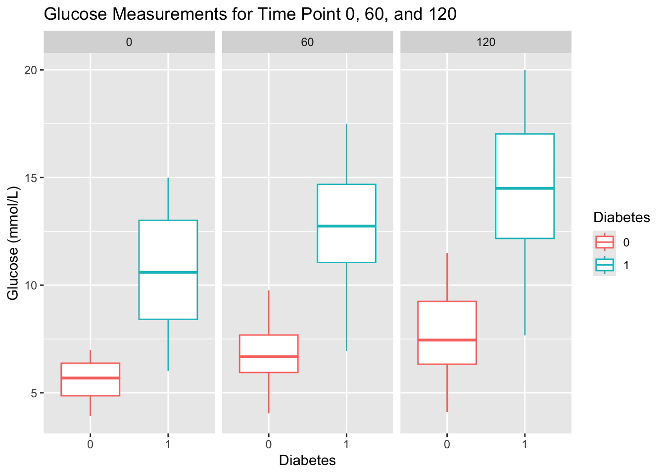
Diabetes. Give the plot a meaningful title.diabetes_glucose %>%
unnest(OGTT) %>%
ggplot(aes(x = Measurement,
y = `Glucose (mmol/L)`)) +
geom_point(aes(color = Diabetes)) +
geom_line(aes(group = ID, color = Diabetes)) +
labs(title = 'Glucose Measurements Across Time Points by Diabetes Status')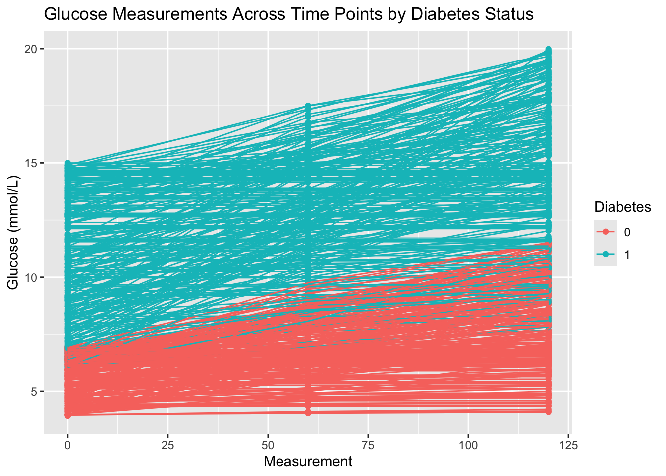
You will need to use unnest(), group_by(), and summerize().
diabetes_glucose %>%
  unnest(OGTT) %>%
  group_by(Measurement) %>%
  summarize(`Glucose (mmol/L)` = mean(`Glucose (mmol/L)`))
# A tibble: 3 × 2
Measurement `Glucose (mmol/L)`
<dbl> <dbl>
1 0 8.06
2 60 9.74
3 120 11.1 Diabetes. Save the data frame in a variable.Group by several variables: group_by(var1, var2).
glucose_mean <- diabetes_glucose %>%
  unnest(OGTT) %>%
  group_by(Measurement, Diabetes) %>%
  summarize(`Glucose (mmol/L)` = mean(`Glucose (mmol/L)`)) %>%
  ungroup()
`summarise()` has grouped output by 'Measurement'. You can override using the
`.groups` argument.glucose_mean# A tibble: 6 × 3
Measurement Diabetes `Glucose (mmol/L)`
<dbl> <chr> <dbl>
1 0 0 5.51
2 0 1 10.6
3 60 0 6.83
4 60 1 12.6
5 120 0 7.89
6 120 1 14.2 This next exercise might be a bit more challenging. It requires multiple operations and might involve some techniques that were not explicitly shown in the presentations.

There are several ways to solve this task. Here is a workflow suggestion:
The line in the plot symbolize a patient ID. You will need to create new IDs for the mean values that are not present in the dataset. Use RANDOM_ID %in% df$ID to check if an ID is already present in the dataset as a patient ID. The ID’s should be added to the data frame created in Exercise 12.
Data from another dataset can be added to the plot like this: + geom_point(DATA, aes(x = VAR1, y = VAR2, group = VAR3))
You can stratify the mean glucose lines by linetype.
The line in the plot symbolize a patient ID. Let’s find two ID’s (one for Diabetes == 0 and another for Diabetes == 1) that are not present in the dataset. We can use the same numbers as the Diabetes status for the ID’s.
0 %in% diabetes_glucose$ID[1] FALSE1 %in% diabetes_glucose$ID[1] FALSEAdd ID’s to the glucose mean data frame.
glucose_mean <- glucose_mean %>%
  mutate(ID = Diabetes %>% as.double())

glucose_mean
# A tibble: 6 × 4
Measurement Diabetes `Glucose (mmol/L)` ID
<dbl> <chr> <dbl> <dbl>
1 0 0 5.51 0
2 0 1 10.6 1
3 60 0 6.83 0
4 60 1 12.6 1
5 120 0 7.89 0
6 120 1 14.2 1Copy-paste the code in Exercise 10 and add lines with new data.
diabetes_glucose %>%
  unnest(OGTT) %>%
  ggplot(aes(x = Measurement,
             y = `Glucose (mmol/L)`)) +
  geom_point(aes(color = Diabetes)) +
  geom_line(aes(group = ID, color = Diabetes)) +
  # Glucose mean data
  geom_point(data = glucose_mean,
             aes(x = Measurement,
                 y = `Glucose (mmol/L)`,
                 group = ID)) +
  geom_line(data = glucose_mean,
            aes(x = Measurement,
                y = `Glucose (mmol/L)`,
                group = ID,
                linetype = Diabetes)) +
  labs(title = "Glucose Measurements with Mean by Diabetes Status")
ggsave('../out/figure3_13.png')Saving 7 x 5 in imageFor this part we will use a tutorial to make a principal component analysis (PCA): https://cran.r-project.org/web/packages/ggfortify/vignettes/plot_pca.html. First, we perform some reprocessing to get the data in the right format.
PCA can only be performed on numerical values. Extract these (except ID) from the dataset. It is up to you to decide whether to include the OGTT measurements. If you include them, unnest the data and convert it to wide format using pivot_wider, ensuring only glucose measurements (not time points) are included as variables in the PCA.
Extract the numerical columns, excluding the OGTT measurements.
numerical_columns <- sapply(diabetes_glucose, is.numeric)
numerical_columns['ID'] <- FALSE
diabetes_glucose_numerical <- diabetes_glucose[numerical_columns]
head(diabetes_glucose_numerical)
Extract the numerical columns, including the OGTT measurements.
diabetes_glucose_unnest_wide <- diabetes_glucose %>%
  unnest(OGTT) %>%
  pivot_wider(names_from = Measurement,
              values_from = `Glucose (mmol/L)`,
              names_prefix = "Measurement_"
              )

numerical_columns <- sapply(diabetes_glucose_unnest_wide, is.numeric)
numerical_columns['ID'] <- FALSE
diabetes_glucose_numerical <- diabetes_glucose_unnest_wide[numerical_columns]

head(diabetes_glucose_numerical)
# A tibble: 6 × 8
Age BloodPressure GeneticRisk BMI PhysicalActivity Measurement_0
<dbl> <dbl> <dbl> <dbl> <dbl> <dbl>
1 34 84 0.619 24.7 93 6.65
2 25 74 0.591 22.5 102 4.49
3 50 80 0.178 34.5 98 12.9
4 27 60 0.206 26.3 82 5.76
5 35 84 0.286 35 58 10.8
6 31 78 1.22 43.3 59 11.1
# ℹ 2 more variables: Measurement_60 <dbl>, Measurement_120 <dbl>diabetes_glucose_numerical_remove_NA <- drop_na(diabetes_glucose_numerical)
diabetes_glucose_remove_NA <- drop_na(diabetes_glucose, any_of(colnames(diabetes_glucose_numerical)))Remember to install and load the ggfortify package.
Notice how you can use the arguments color and colour interchangeably.
library(ggfortify)Warning: pakke 'ggfortify' blev bygget under R version 4.2.3pca_res <- prcomp(diabetes_glucose_numerical_remove_NA, scale. = TRUE)
autoplot(pca_res, data = diabetes_glucose_remove_NA, color = "Diabetes")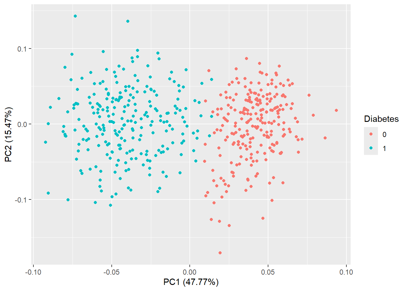
autoplot(pca_res, data = diabetes_glucose_remove_NA, colour = 'Diabetes', label = TRUE, label.size = 3)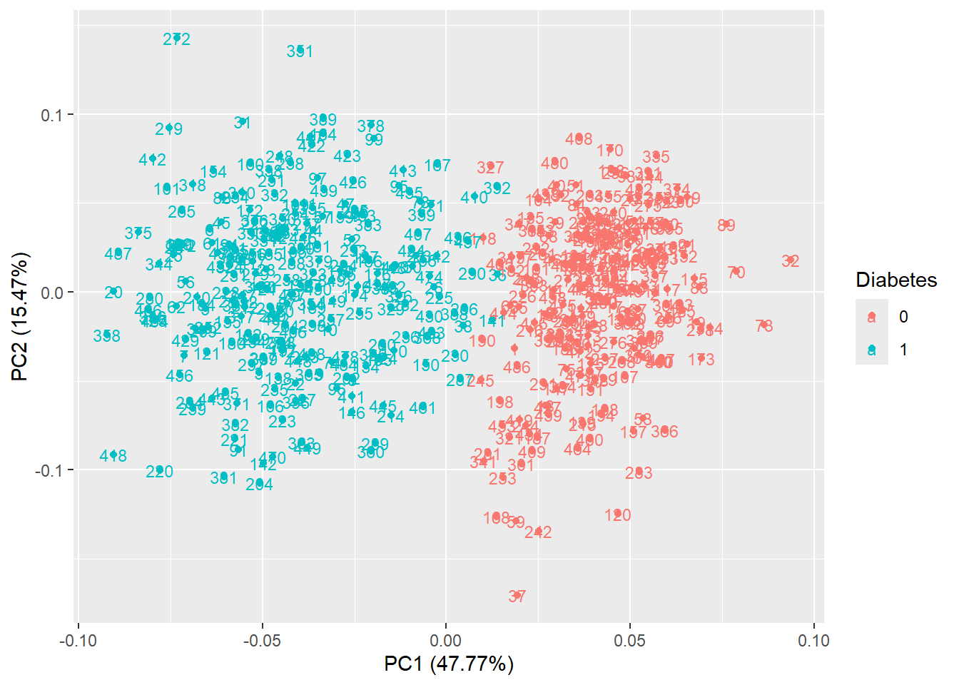
autoplot(pca_res, data = diabetes_glucose_remove_NA, colour = 'Diabetes', shape = FALSE, label.size = 3)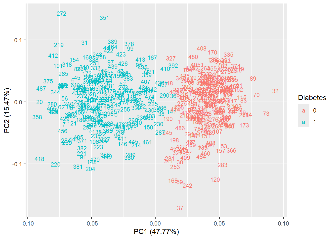
autoplot(pca_res, data = diabetes_glucose_remove_NA, colour = 'Diabetes', loadings = TRUE)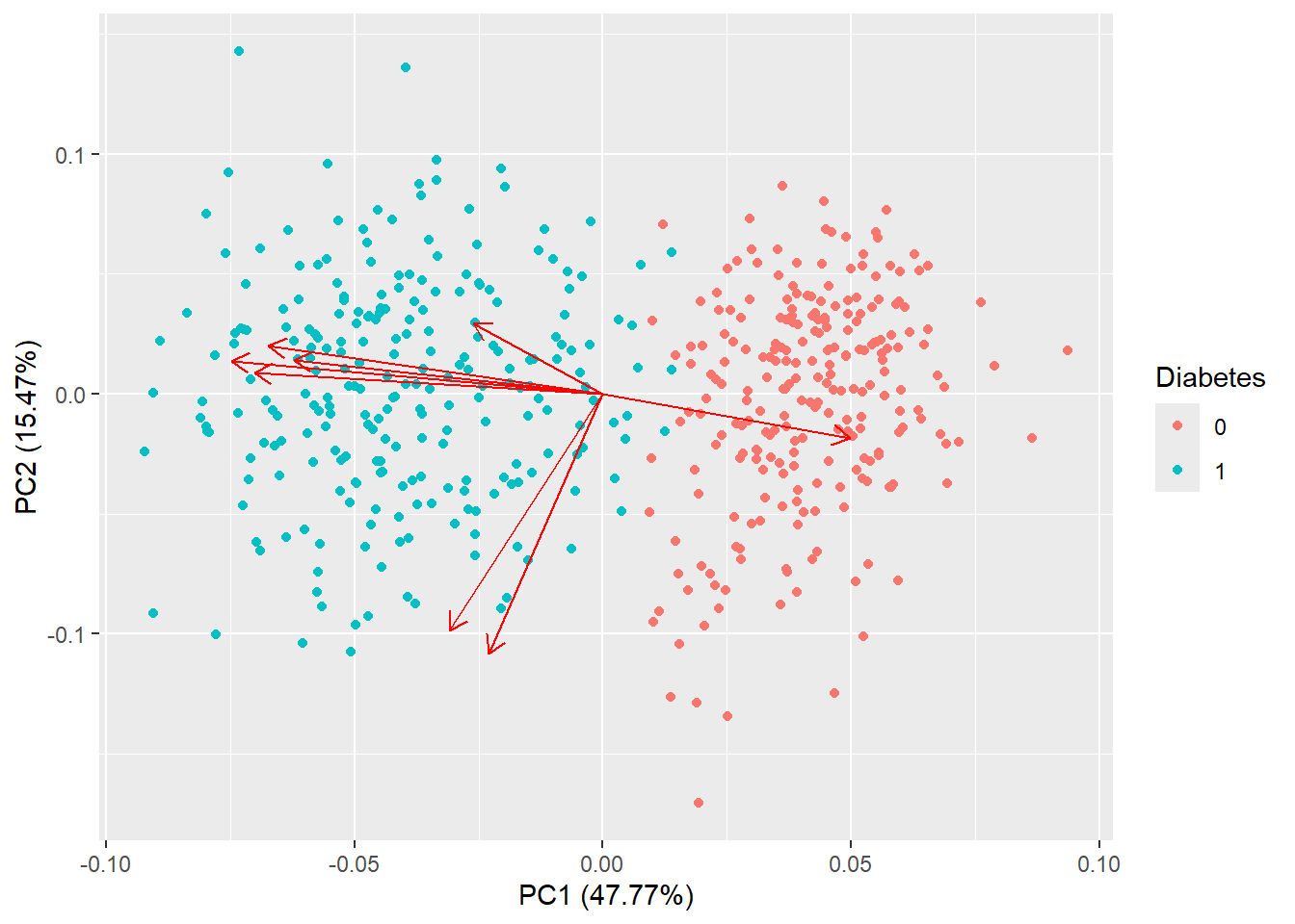
autoplot(pca_res, data = diabetes_glucose_remove_NA, colour = 'Diabetes',
         loadings = TRUE, loadings.colour = 'blue',
         loadings.label = TRUE, loadings.label.size = 3)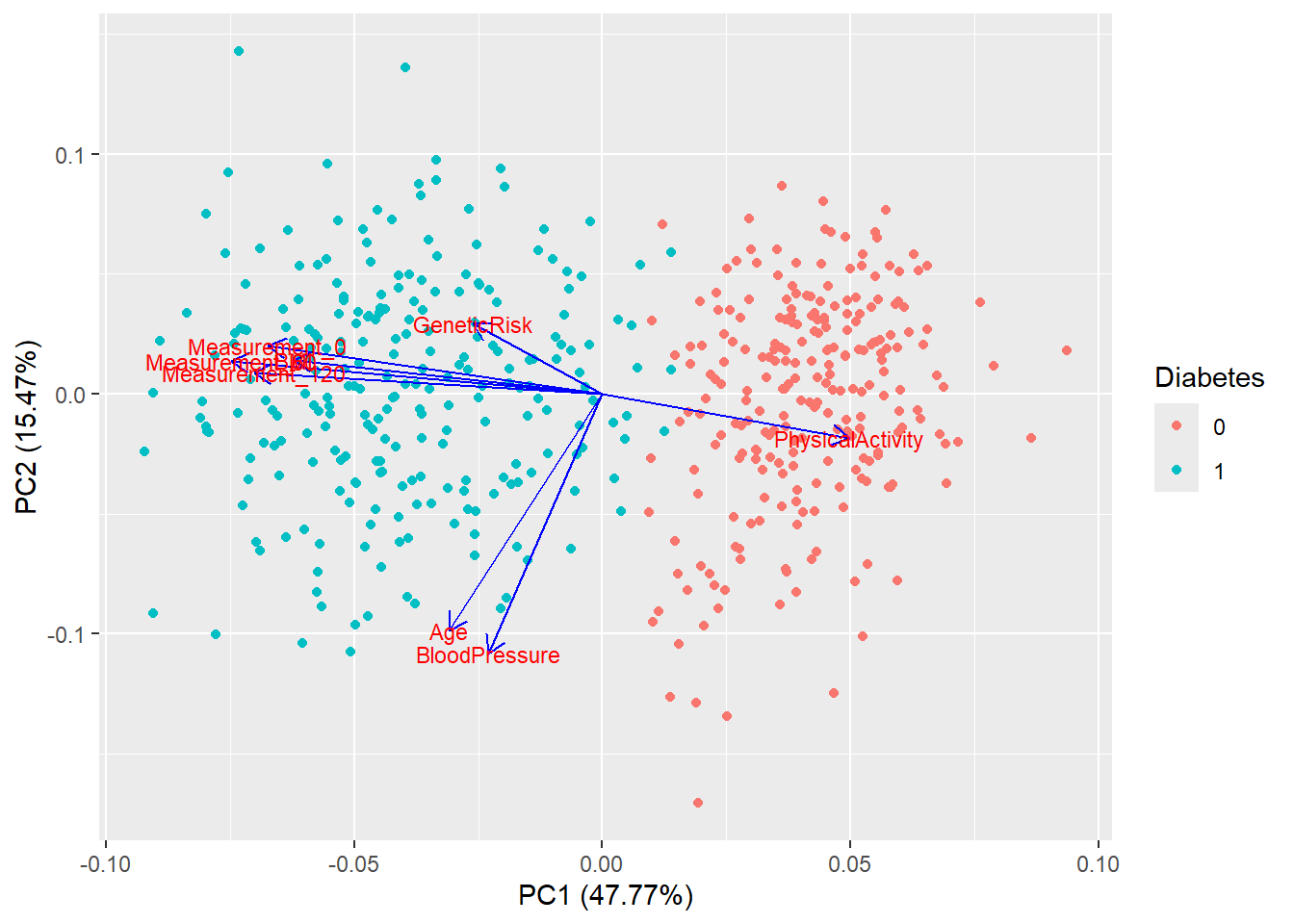
theme, title and whatever else you would like.Want to change the size of your plot:
Copy-paste the plot-code to the console.
Press Export → Copy to Clipboard…
Drag the plot in the bottom-right corner to adjust the size.
Note down the width and the height and write the values to the width and height arguments of the ggsave function.
autoplot(pca_res, data = diabetes_glucose_remove_NA, colour = "Diabetes",
         loadings = TRUE, loadings.colour = "grey30", loadings.label.colour = "black",
         loadings.label = TRUE, loadings.label.size = 3.5) +
  theme_minimal() +
  labs(title = "PCA of Diabetes Dataset")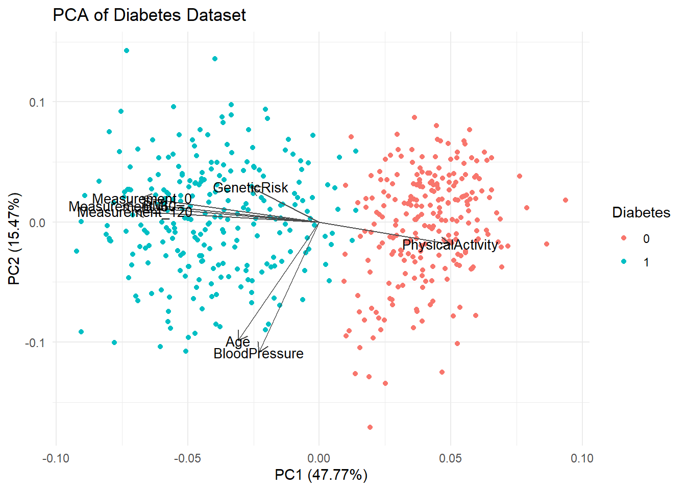
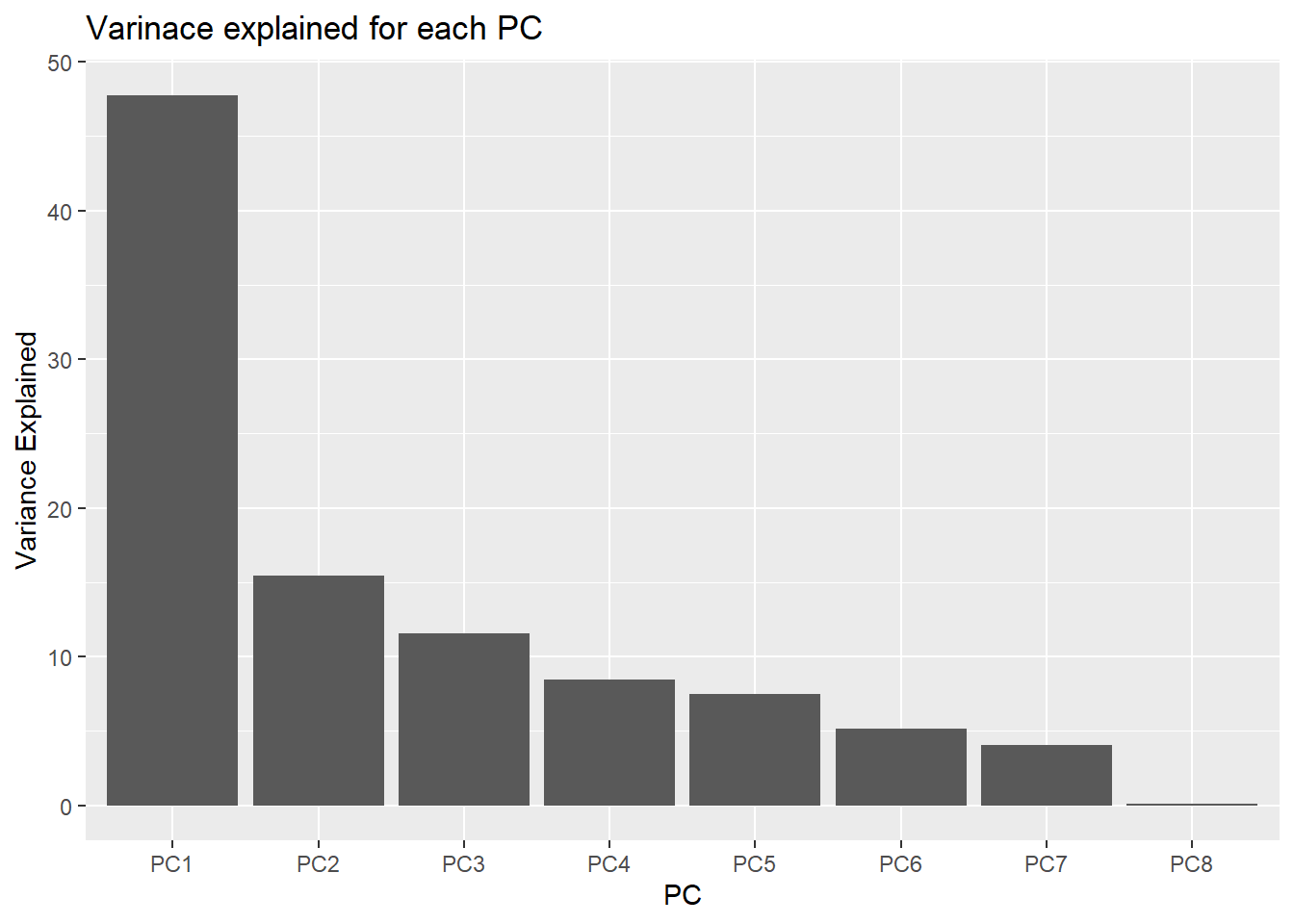
# ggsave('../figures/PCA_diabetes.png', width = 7, height = 5)\[ \text{Variance Explained} = \frac{\text{sdev}^2}{\sum \text{sdev}^2} \times 100 \]
Access the standard deviation from the PCA object like this: pca_res$sdev.
variance_explained <- ((pca_res$sdev^2) / sum(pca_res$sdev^2)) * 100df_variance_explained <- tibble(PC = c(paste0('PC', 1:length(variance_explained))),
variance_explained = variance_explained)
df_variance_explained# A tibble: 8 × 2
PC variance_explained
<chr> <dbl>
1 PC1 47.8
2 PC2 15.5
3 PC3 11.6
4 PC4 8.45
5 PC5 7.51
6 PC6 5.14
7 PC7 4.02
8 PC8 0.0897df_variance_explained %>%
ggplot(aes(x = PC,
y = variance_explained))+
geom_col() +
labs(title = "Varinace explained for each PC",
y = "Variance Explained")